Regina Hoefter
Website
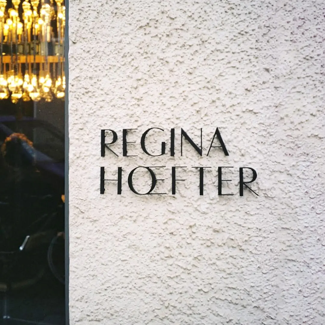
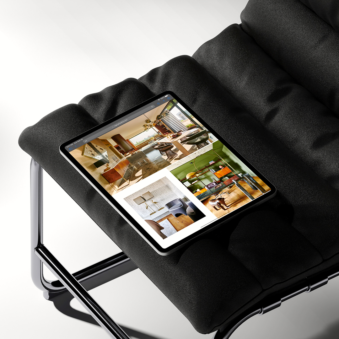
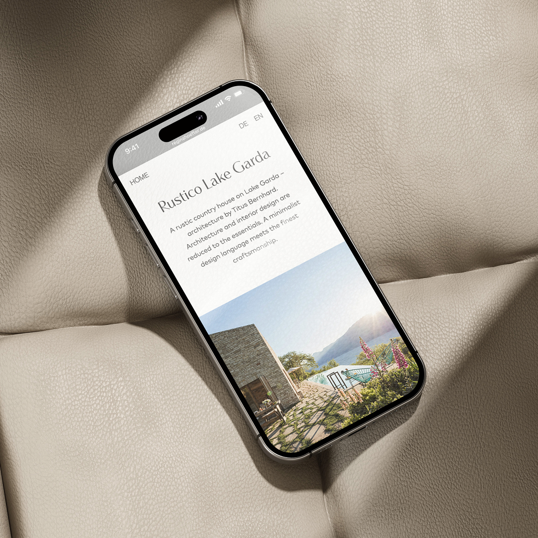
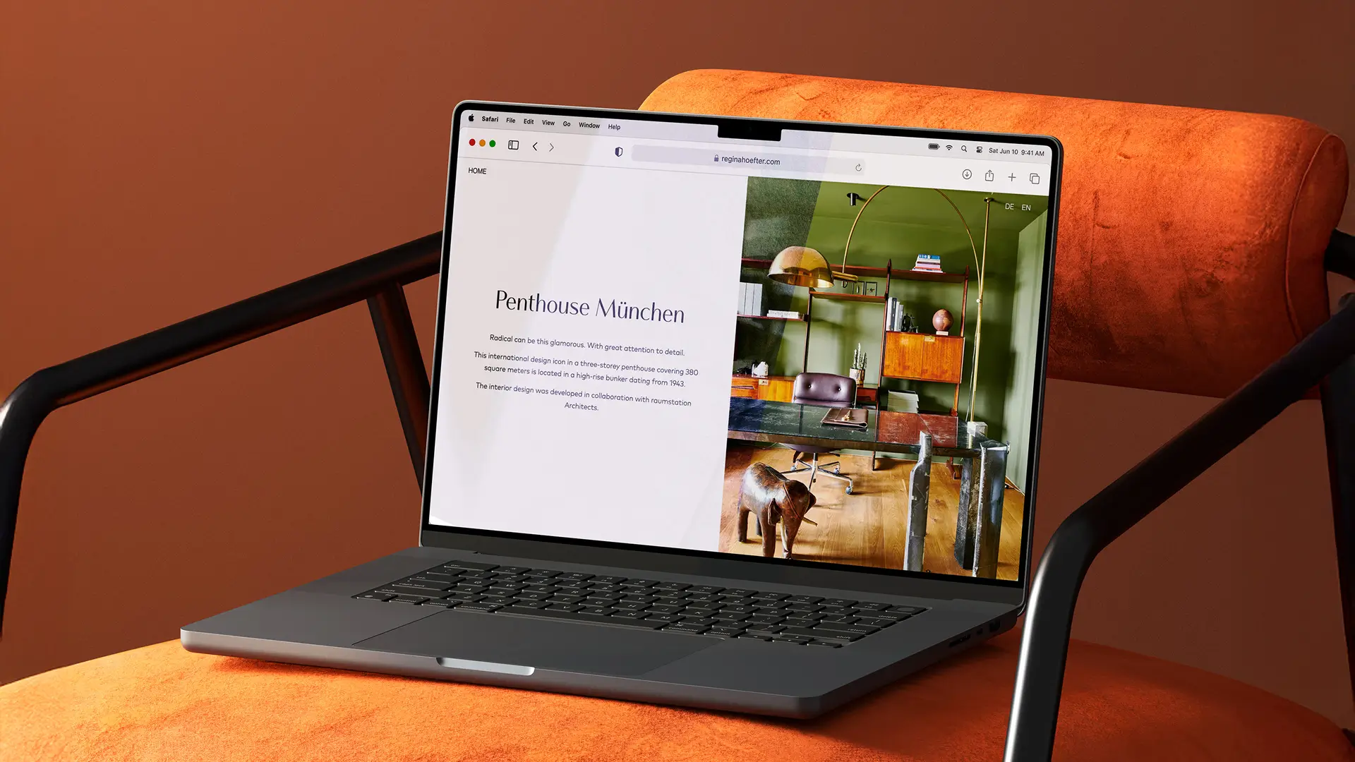
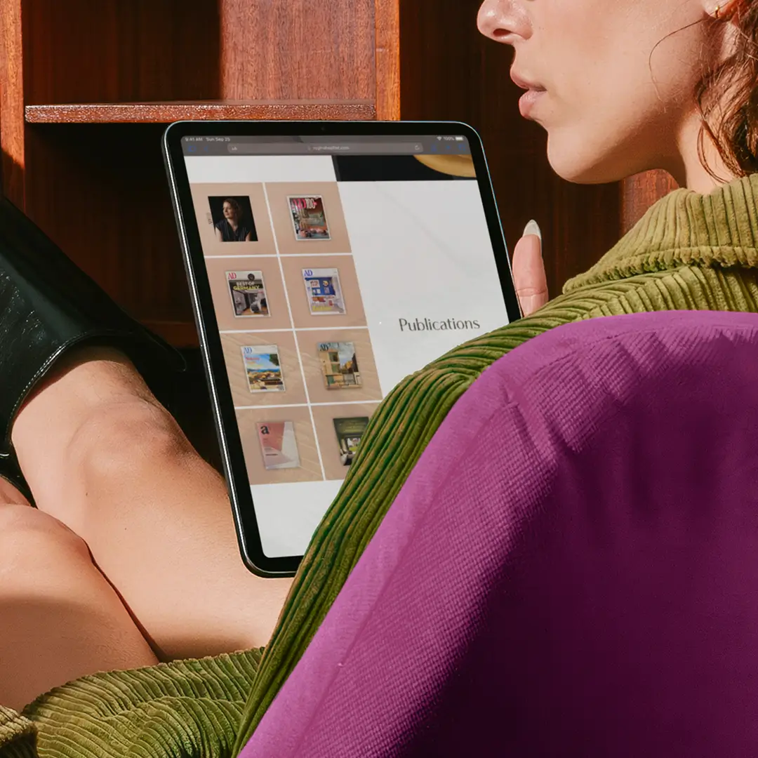
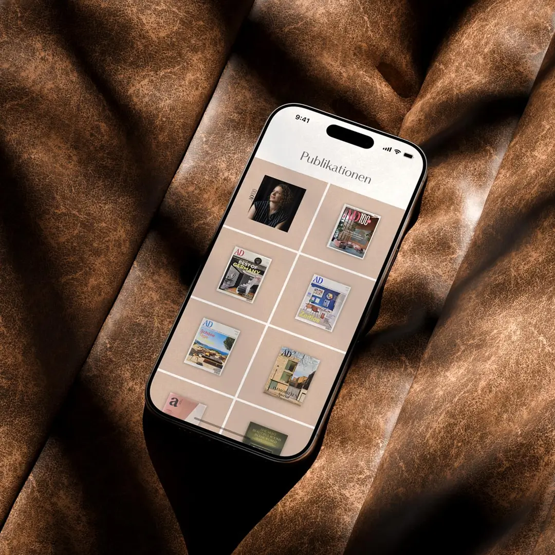
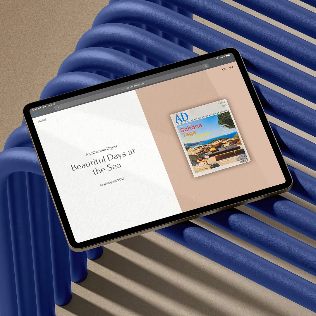
Regina Hoefter is a Munich-based interior designer featured among Architectural Digest’s Top 100 Interior Designers Germany. Her timeless, minimalist aesthetic required a digital platform that matched the clarity and refinement of her work. Commissioned by the design bureau NotJust*, the static design was transformed into a responsive WordPress website that balances elegance with long-term scalability.
| Product | Responsive WordPress portfolio website |
| Role | Senior UI/UX Designer & Front-End Developer |
| Key Skills | Design audit Responsive UI design Front-end implementation (WordPress) System thinking for small design systems Typography systems Spacing systems CMS setup Documentation |
| Team | Anna Saar, NotJust* |
| Client | Regina Hoefter |
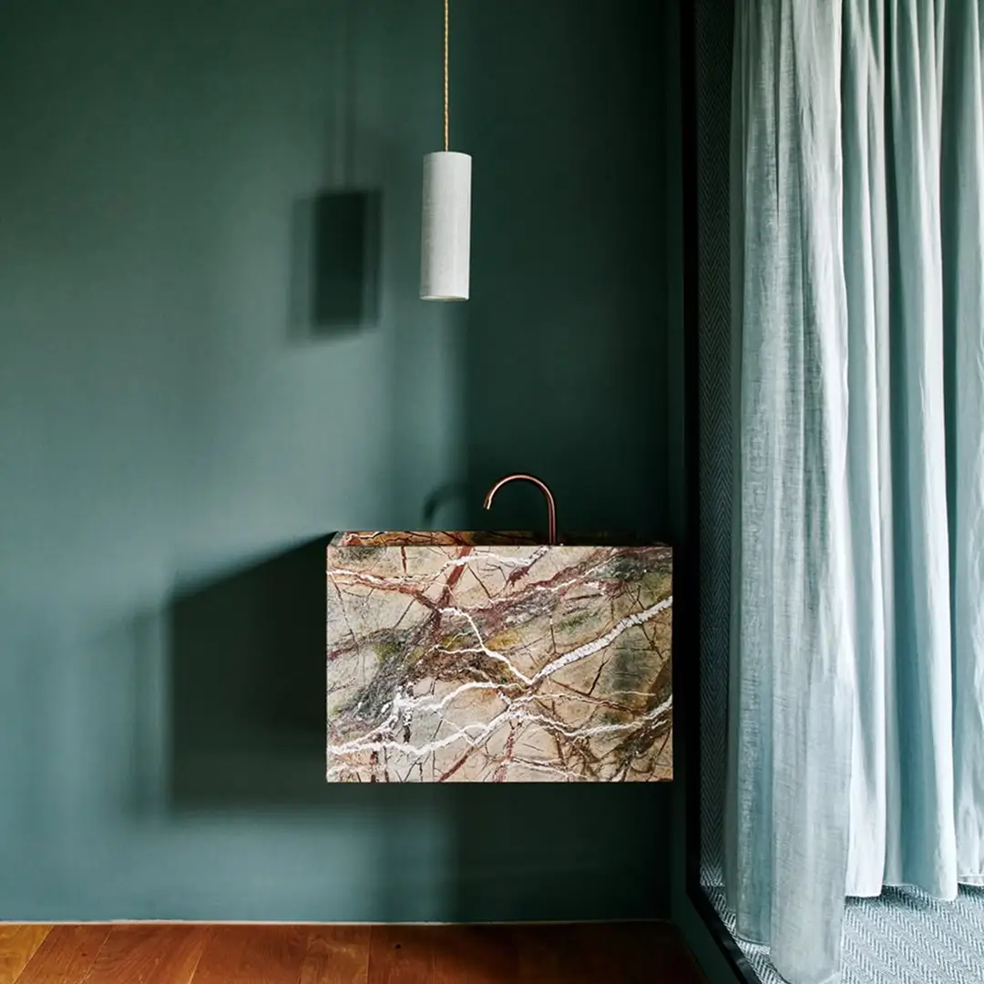
| All interior photographs are courtesy of the artist. |
Task — From static layout to responsive experience
A static design does not translate directly into a functional digital product. The goal was to transform the provided layouts into a responsive, scalable website while preserving the clarity and elegance of the original design. This included:
- Auditing the design for responsiveness and UX gaps
- Translating fixed layouts into flexible, fluid structures
- Ensuring usability across desktop, tablet, and mobile
Project Roadmap
1
Audit
Review agency PDF design, identify responsiveness and UX gaps
2
Setup
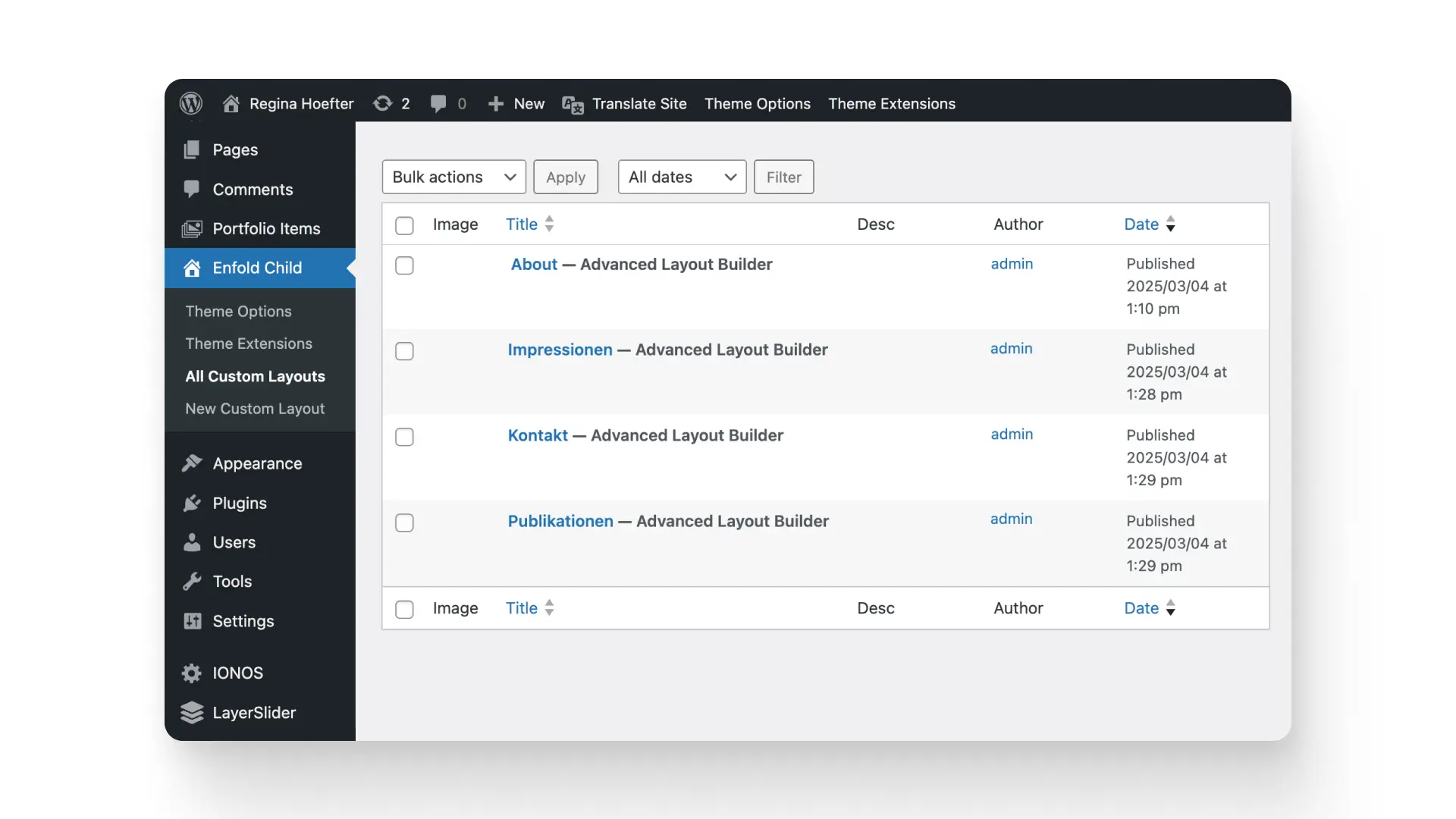
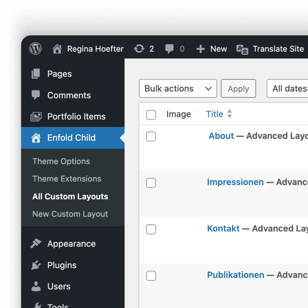
Install WordPress, configur Enfold theme as the technical backbone.
3
Implementation
Custom CSS, JS, and PHP scripts; font upload; build interactive modules
4
Refinement & Launch
Final polish with design-system thinking: responsive grids, scalable typography, and intuitive CMS setup.
Approach — Bridging design intent and real-world constraints
The website was built in WordPress using the Enfold theme as a flexible foundation, combining visual fidelity with technical precision.
“The website was supposed to feel like Regina’s interiors — effortless, precise, and unforgettable.”
Sitemap

Sitemap

System — Structure, consistency, and scalability
To ensure long-term usability and consistency, a system-based approach was applied across the entire website. This included:
- Typography and spacing systems optimized for readability
- Section-based layout structure with reusable components
- Modular WordPress setup enabling scalable content management

Colors
#5F7077 — Dove Grey
#A88531 — Luxor Gold
#DBBCAA — Cashmere
#92A0A0 — Cool Grey
#93948E — Oslo Grey
#E5DFD3 — Pearl
#323232 — Warm Charcoal
Impact — A scalable and maintainable digital portfolio
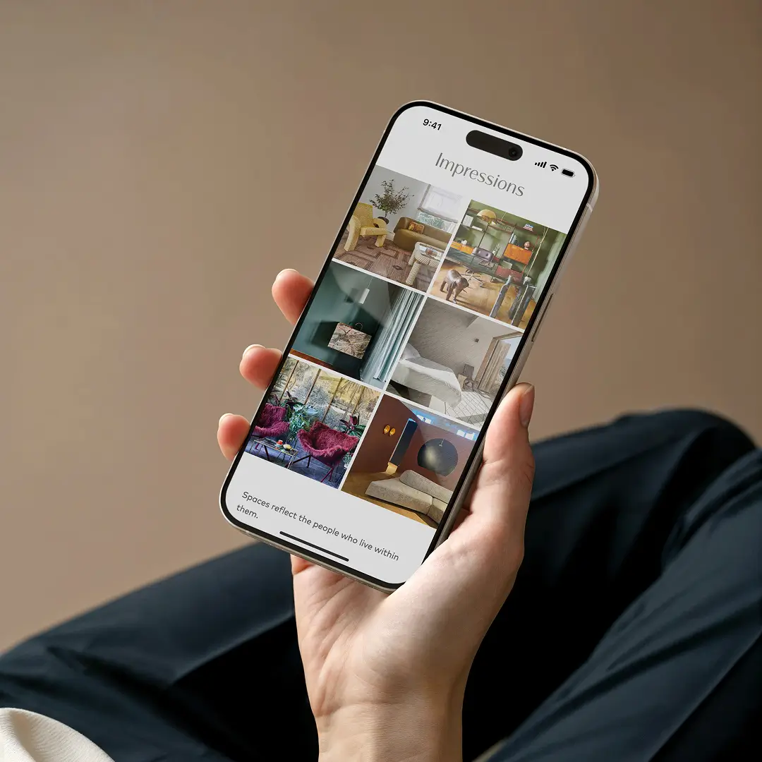
The result is a refined digital platform that translates Regina Hoefter’s aesthetic into a clear and responsive user experience. It enables:
- Consistent presentation across all devices
- A fully maintainable CMS for independent content updates
- A scalable structure ready to grow with future projects
© Anna Saar, 2026
Text, images and code made with 💕and ☕
Text, images and code made with 💕and ☕
© Anna Saar, 2026