Ampler Bikes
Design System
Ampler creates lightweight e-bikes that merge minimalist design with smart technology. As their digital ecosystem expanded across e-commerce, mobile app, and on-bike interfaces, a unified design system was needed to ensure consistency and scalability. The project established a token- and component-based UI system, documented in Figma to enable efficient collaboration between design and engineering.
| Product | Multi-platform design system for web, mobile app and bike interface |
| Role | Design Systems Designer |
| Key Skills | Design systems strategy Token-based design architecture Figma component systems Multi-platform UI design Design documentation Naming conventions & scalability Design–developer collaboration |
| Team | Ampler Design Team (Anna Saar, Jörgen Kursk, Kaur Kask, Tobias Textor) & Software Engineering Team (Andrii Hrynchuk, Karim Megahed, Margit Loo, Helena Lissenko, Küllike Kimmel, Janita Raudsepp) |
| Client | Ampler Bikes |

Task — Building a unified multi-platform design system
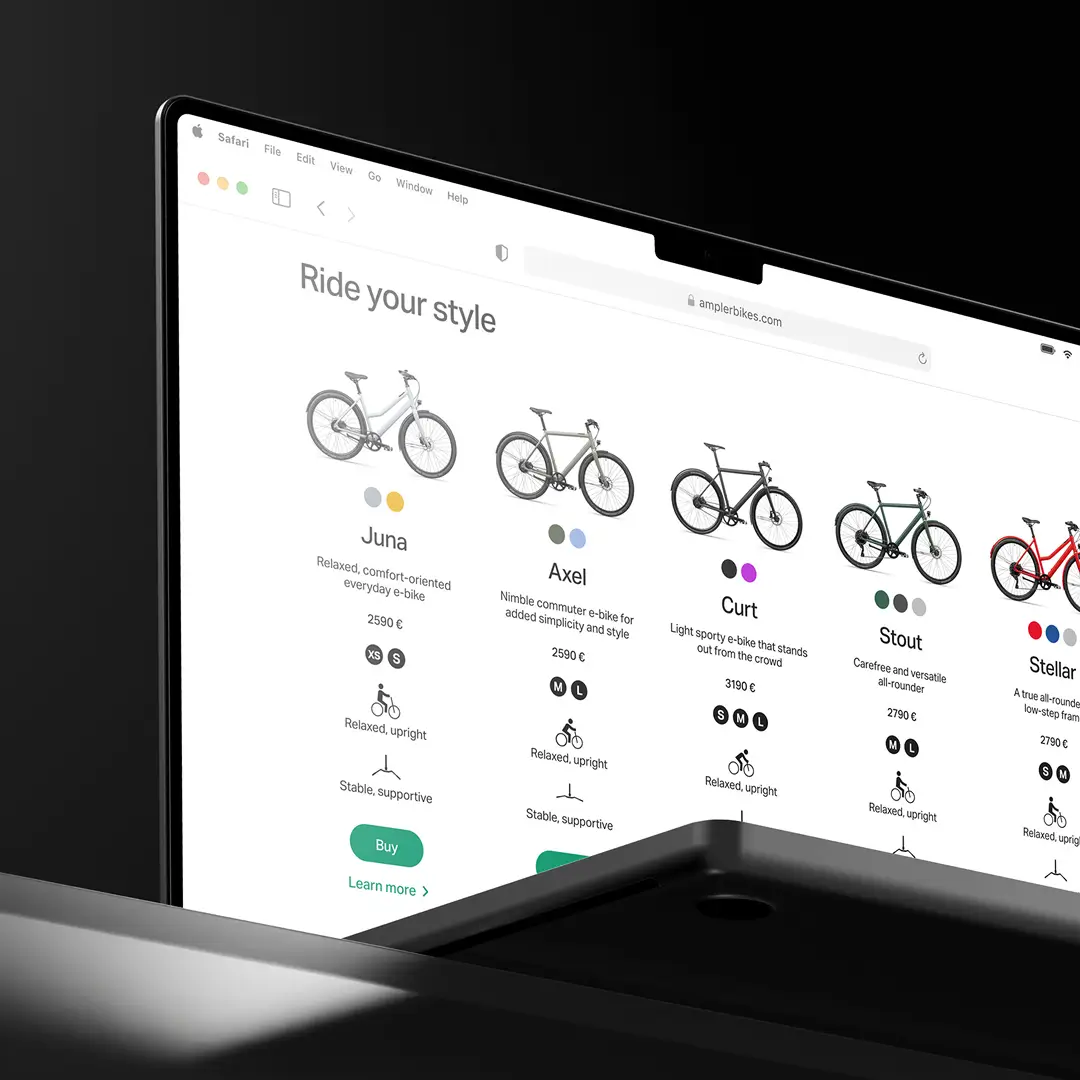
As a fast-growing e-bike company, Ampler Bikes needed a scalable design system that could support multiple digital touchpoints and ensure consistency, efficiency, and scalability. The goal was to create a scalable, consistent, and efficient design system that worked seamlessly across their three core products:
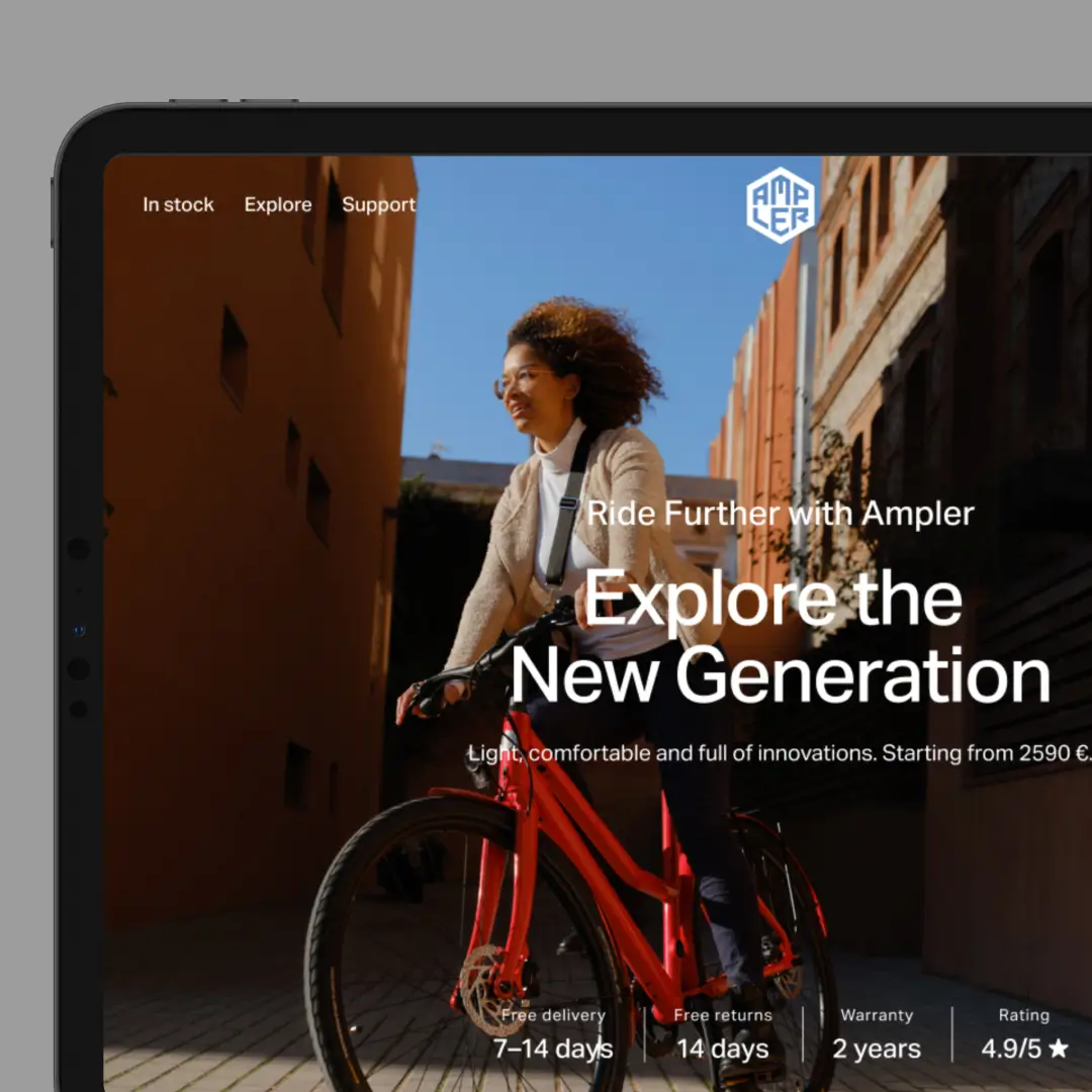
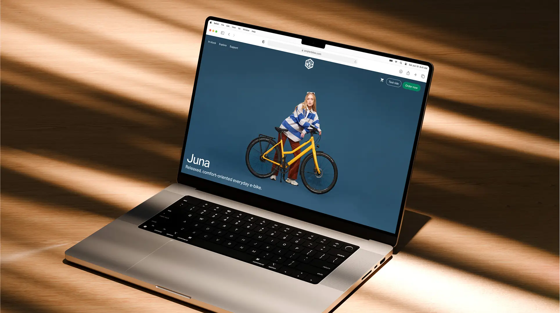
Website
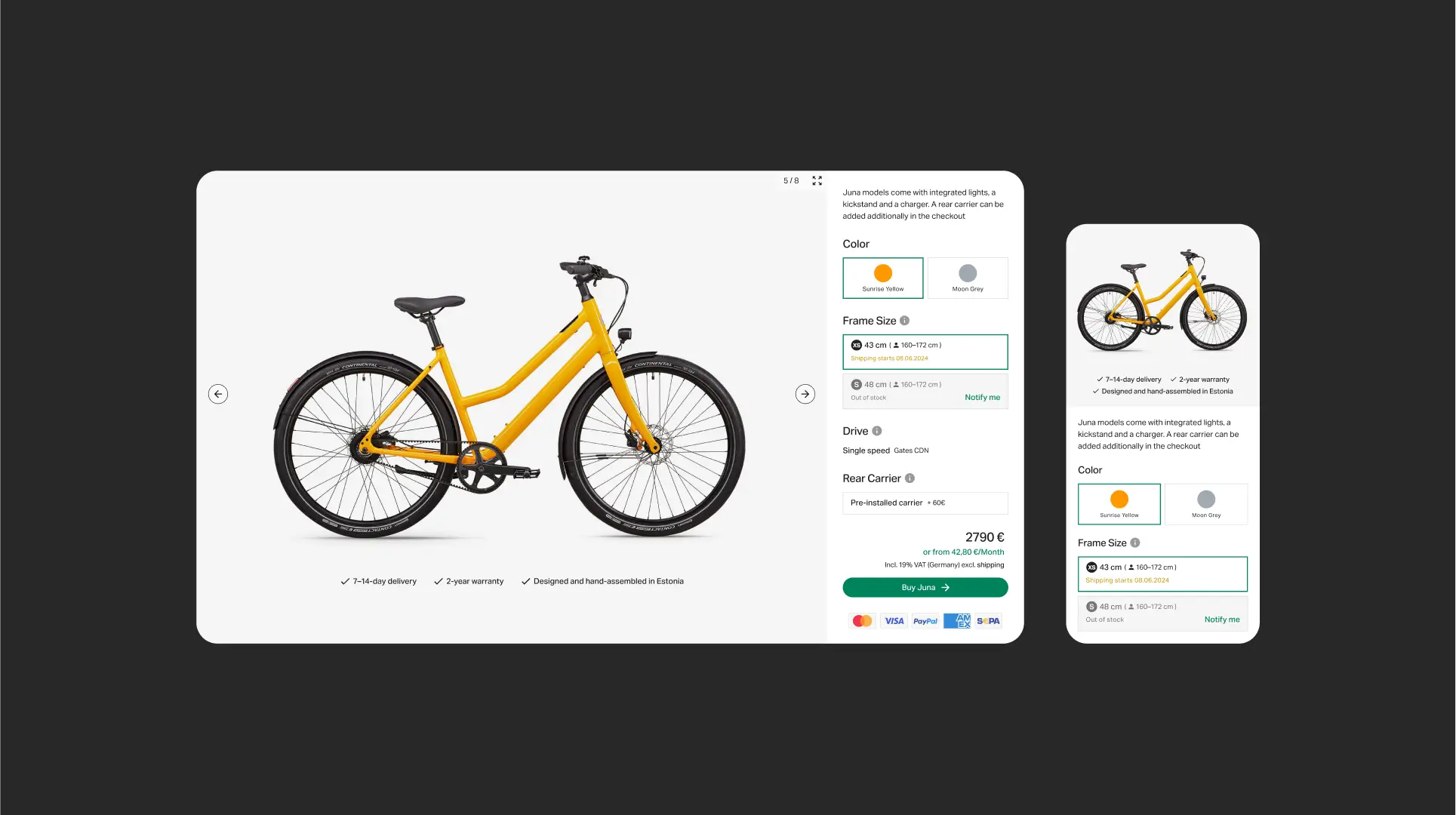
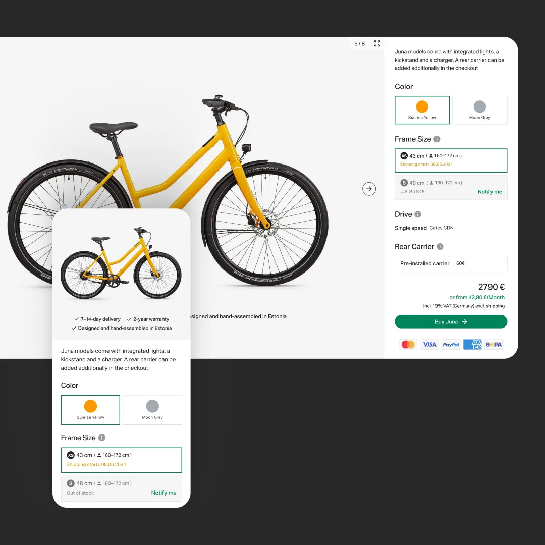
E-commerce platform featuring a custom bike configurator, immersive brand storytelling, and a dedicated support hub.
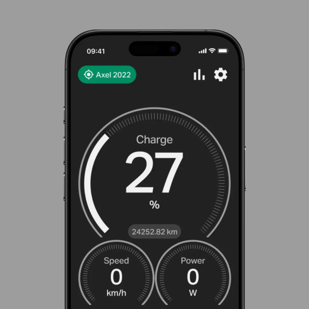
App
Mobile application for adjusting bike settings, enabling theft protection, GPS tracking, and ride customization.
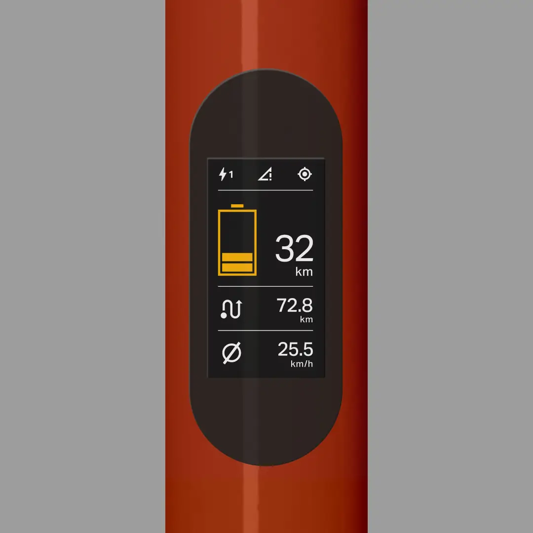
LCD Display
Integrated top-tube display providing real-time e-bike vitals, ride statistics, and battery insights.
Project Roadmap
1
Research
Analyzed all digital touchpoints (web, app, bike UI) and identified visual inconsistencies and UX gaps.
2
Systemization
Defined the core design elements: typography, color, spacing, and component variants.
3
Documentation
Created comprehensive Figma libraries with clear usage guidelines and example patterns.
4
Integration
Collaborated with developers to implement the system, ensured QA, and iterated on feedback.
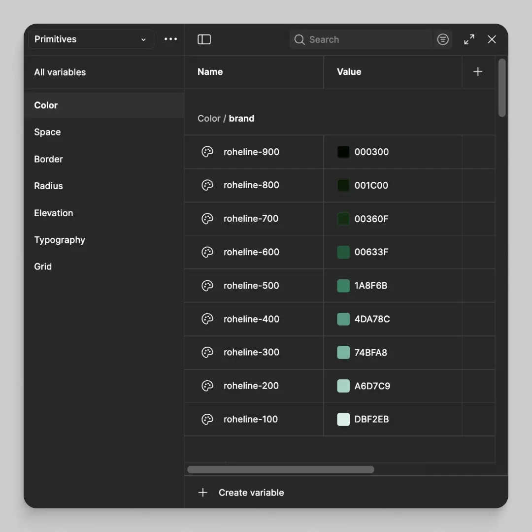
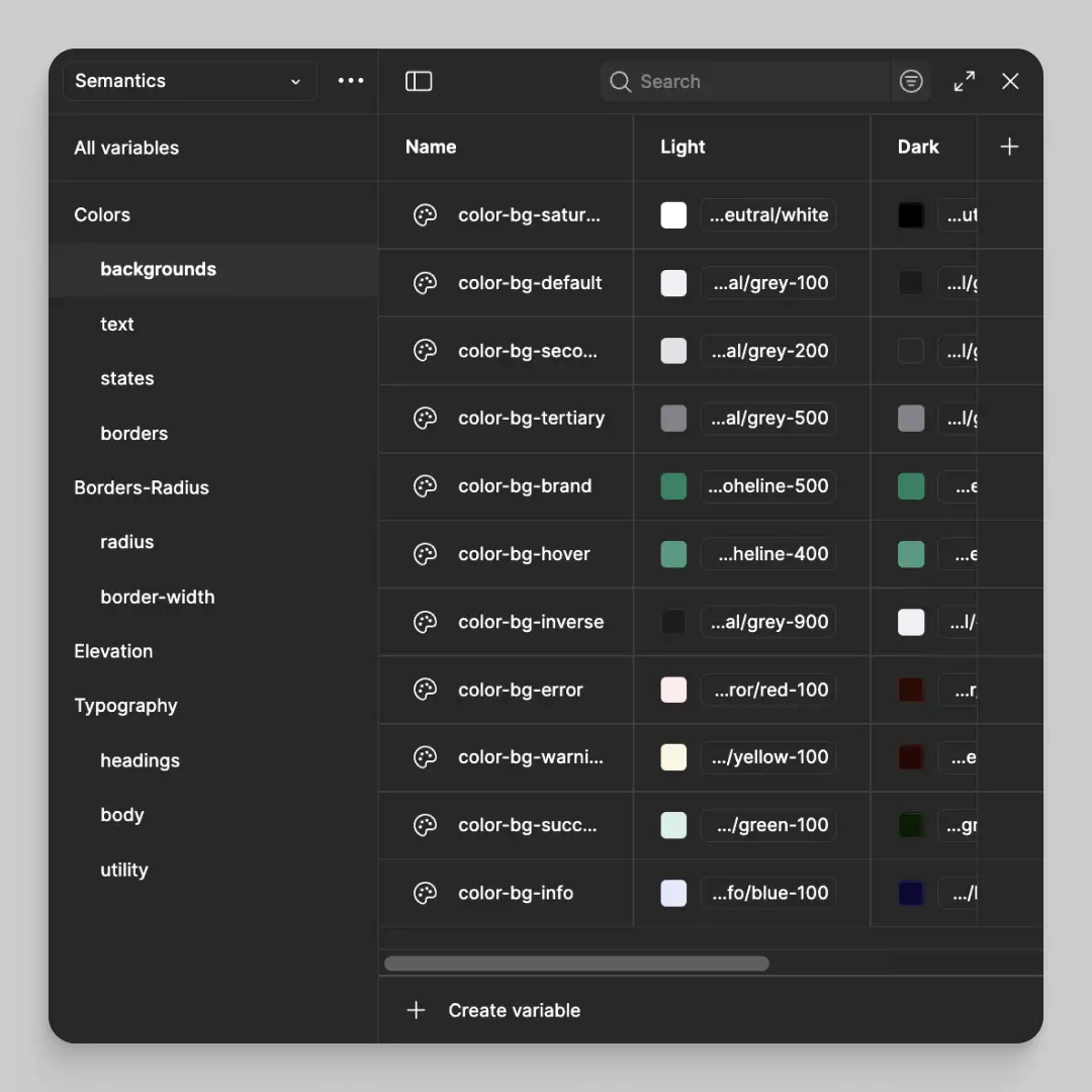
Systematizing UI — A Foundation of Tokens, Grids, and Logic
When I started building Ampler's design system, Figma offered no component variants or variables. I began establishing a foundation of reusable components and created a structured design library in Figma. Later, I extended it with variants and variables as Figma evolved. The system grew into:
- Primitives: colors, spacing, typography, elevation
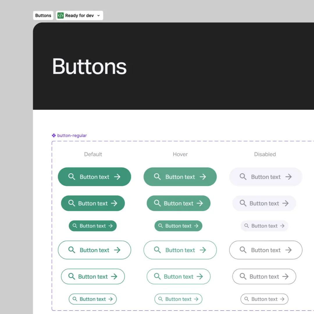
- Components: buttons, forms, navigation, cards
- Patterns: layouts, bike configurator flows, app dashboards
Core Styles


Primitive & Semantic Variable Collections
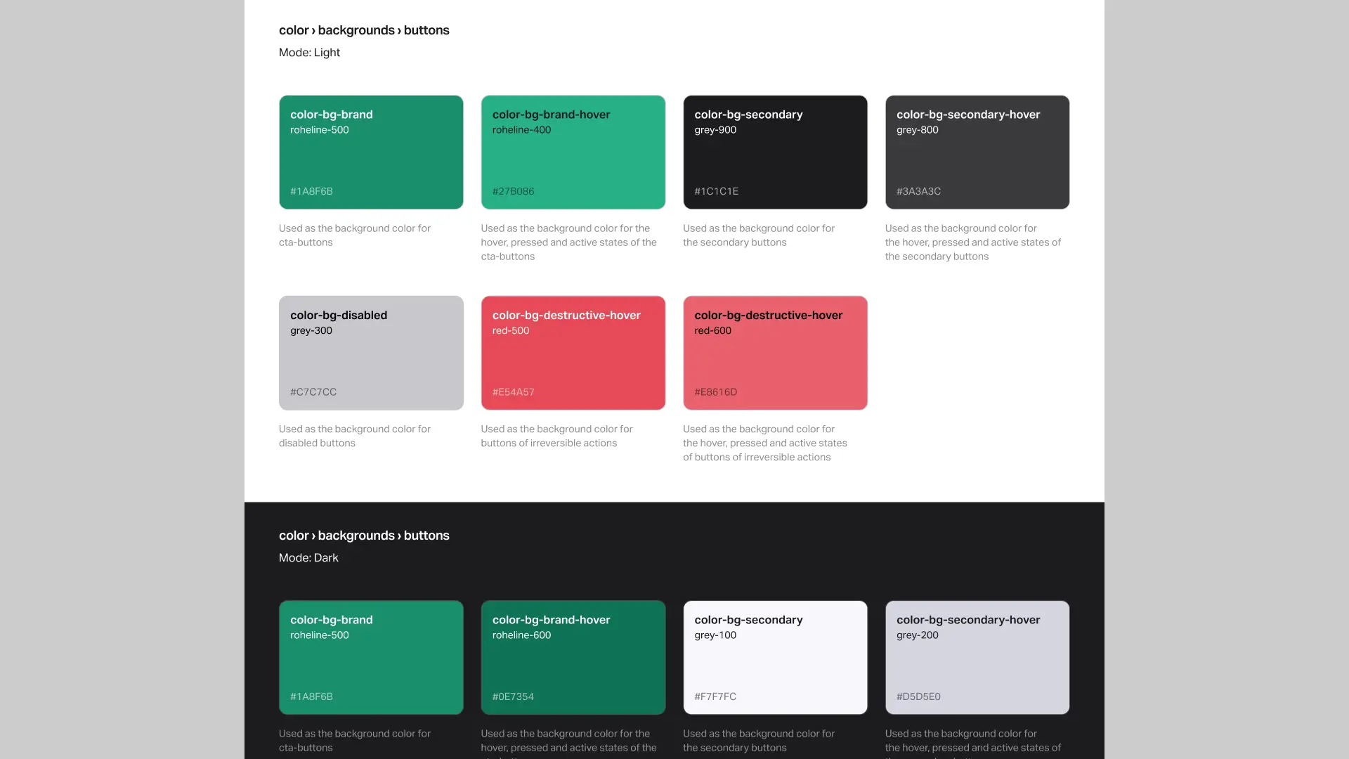
Collaboration & Documentation — Aligning Design and Development in Figma
The initial documentation was fragmented across files, making consistency and handoff difficult. To align with developers, we kept documentation directly in Figma, ensuring that design and code stayed in sync without external tools. Components were structured with variants, states, and responsive behavior in mind.
- Documented logic inside Figma using naming conventions
- Component usage guidelines
- Interaction notes (e.g. hover/pressed, active, disabled)
- Real-time feedback and versioning
Design systems are not just about consistency — they’re about shared understanding. — Brad Frost
One System, Three Platforms — Web, App, and Bike UI
For the system to work across three platforms solutions included:
- Shared design principles across all surfaces
- Flexible component variants
- Simplified type and icon sizes for LCD
Web — Marketing & E-commerce Website

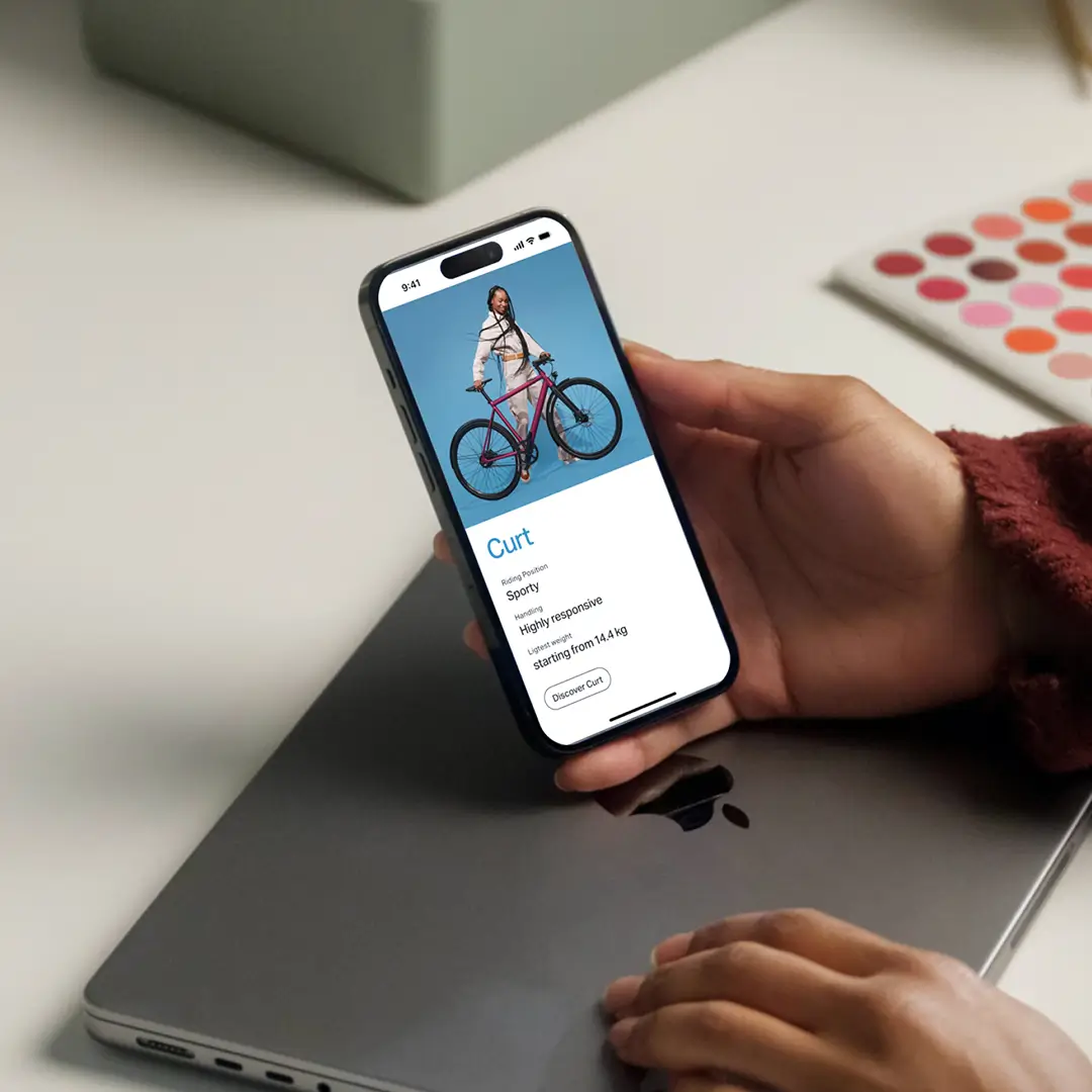
Mobile App — Ampler Companion App


LCD Screen — Ampler ABC Unit

Design systems scale design across contexts — not just screens. — Nathan Curtis
Results & Reflection — A scalable design ecosystem
The final design system enabled:
- Faster prototyping and iteration cycles
- Clear naming conventions and hierarchy
- Consistency across web, app, and bike interfaces
- Improved developer–designer collaboration
- Supported Ampler’s growth into new markets with a strong, cohesive brand identity
The design system became a single source of truth, supporting ongoing growth and brand scalability.


© Anna Saar, 2026
Text, images and code made with 💕and ☕
Text, images and code made with 💕and ☕
© Anna Saar, 2026