Thekra Jaziri
Website
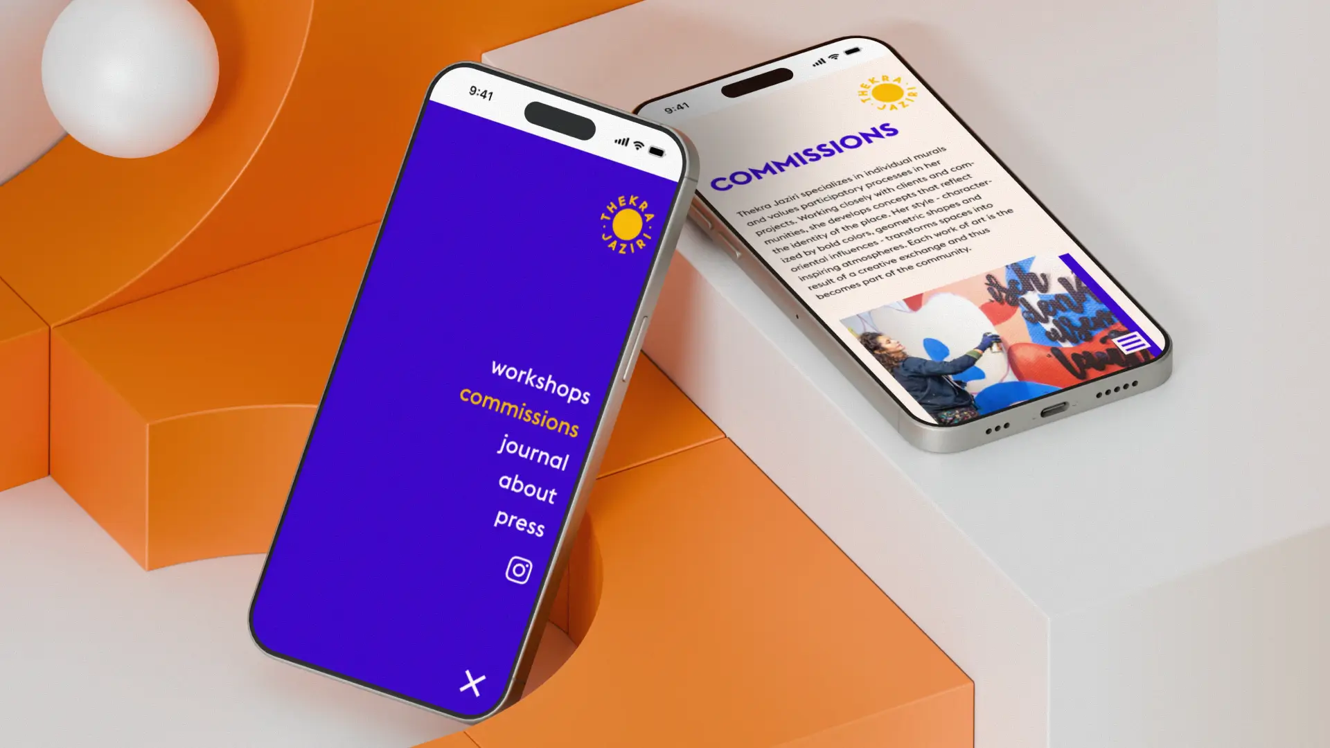
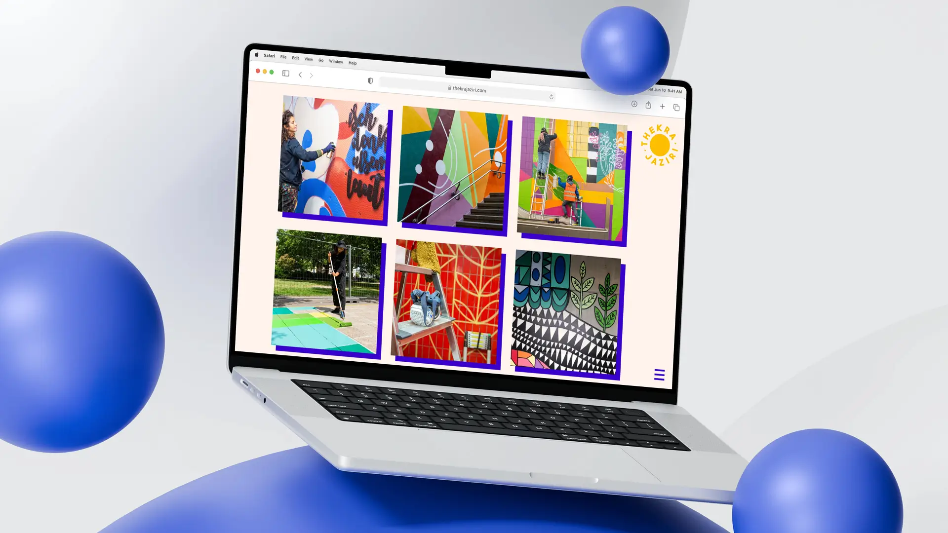
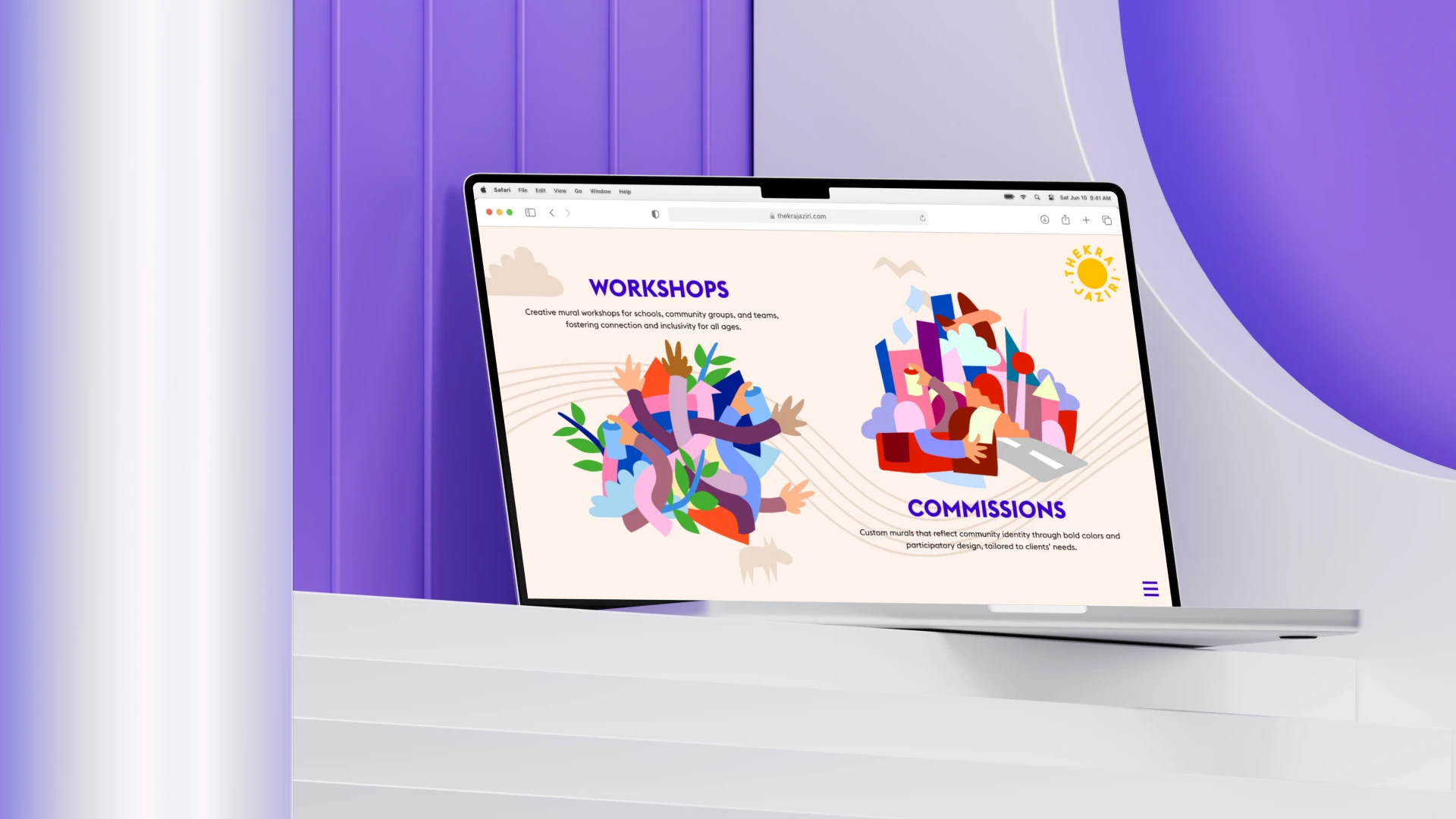
Thekra Jaziri is a mural artist who uses vibrant visuals to tell stories and reimagine urban spaces. Her growing body of work required a digital platform that reflected the same bold and participatory spirit as her murals. Developed in collaboration with Thekra and the team at silly.berlin, the project resulted in a responsive, animated portfolio website designed for storytelling and long-term maintenance.
| Product | Responsive portfolio website with interactive animations |
| Role | Senior UI/UX Designer & Front-End Developer |
| Key Skills | Design auditing Responsive UI design WordPress development Animation design (Lottie) Scroll interactions CMS documentation & handoff |
| Team | Anna Saar, silly.berlin, Thekra Jaziri |
| Client | Thekra Jaziri |
| All artworks shown are courtesy of the artist. |
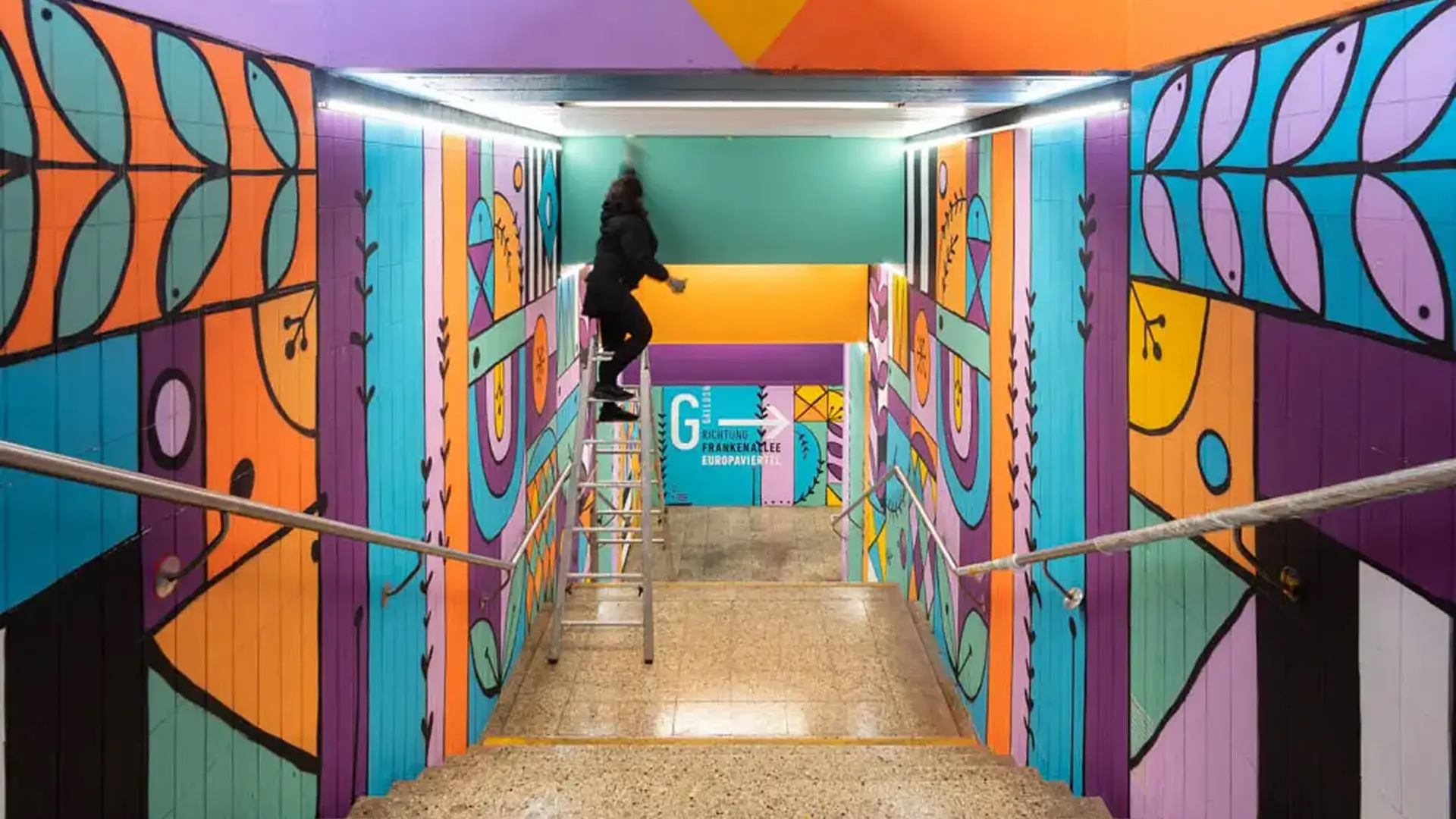
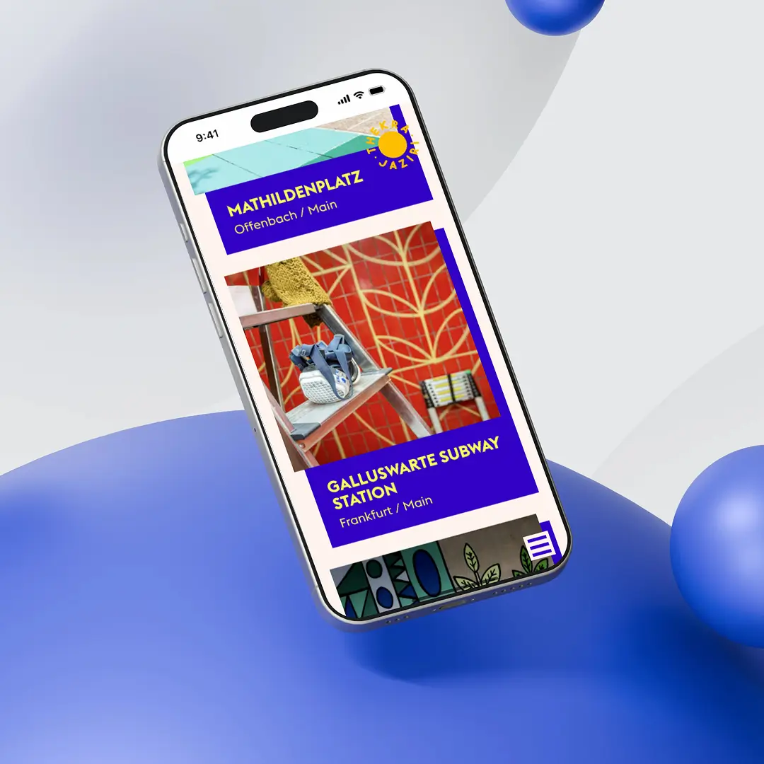
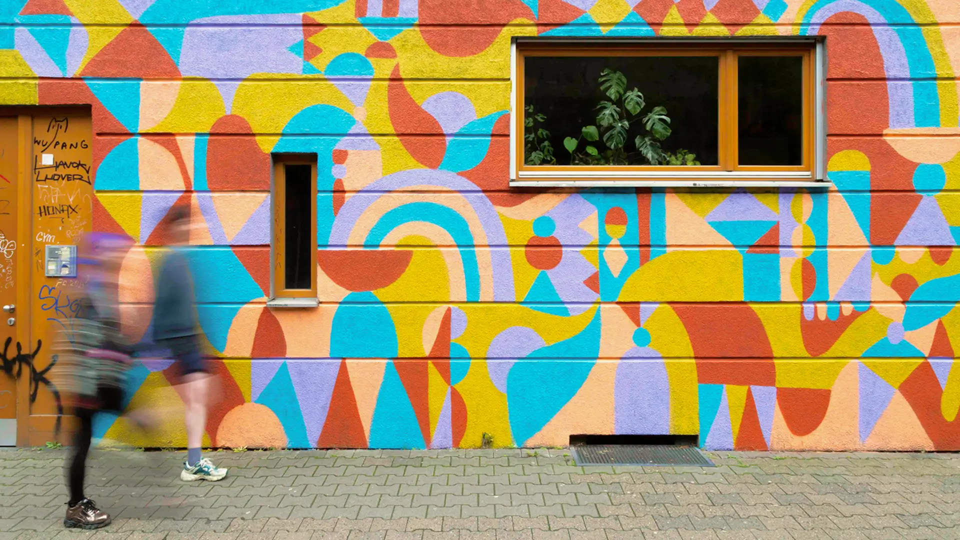
Frankfurt Galluswarte subway station
Task — From Flat Design to Fluid Experience
Project Roadmap
1
Research
Analyze client needs, evaluate the provided layout & sitemap, define clear project goals.
2
Audit
Review the existing design and extend it to tablet and mobile. Offer UX recommendations and apply typographic and spacing systems.
3
Design & Develop
Build the site in WordPress from scratch. Bring it to life with subtle animations. Refine based on ongoing feedback.
4
Finalize
Test across devices, ensure accessibility and responsiveness, and deliver a clear CMS usage guide for future updates.
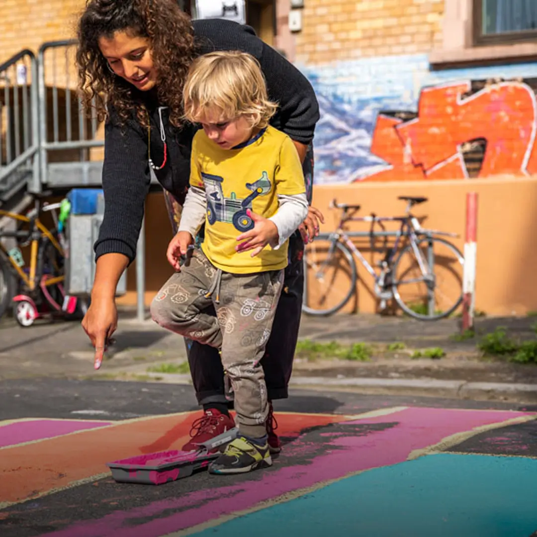
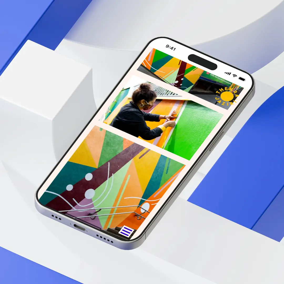
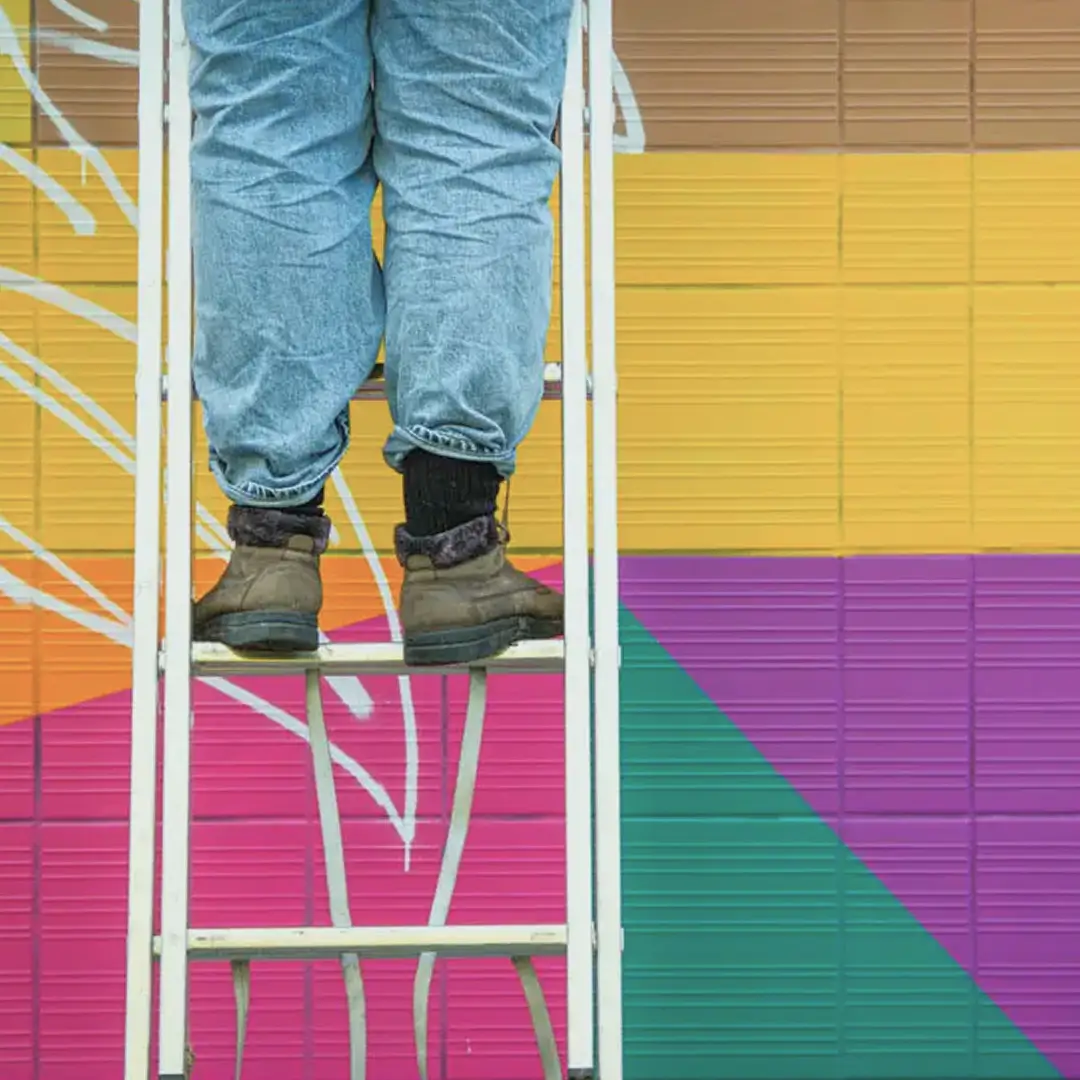
Thekra at one of her workshops
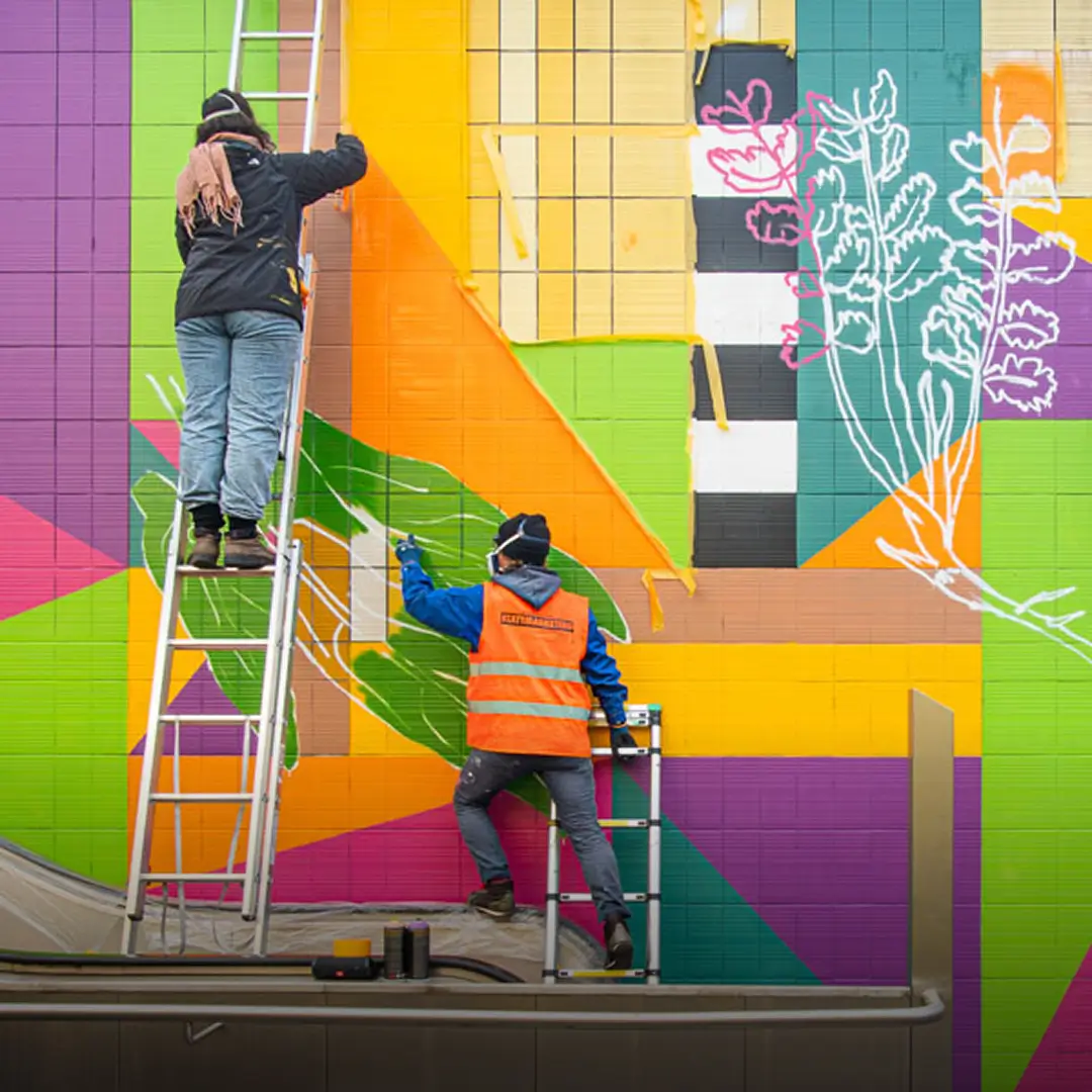
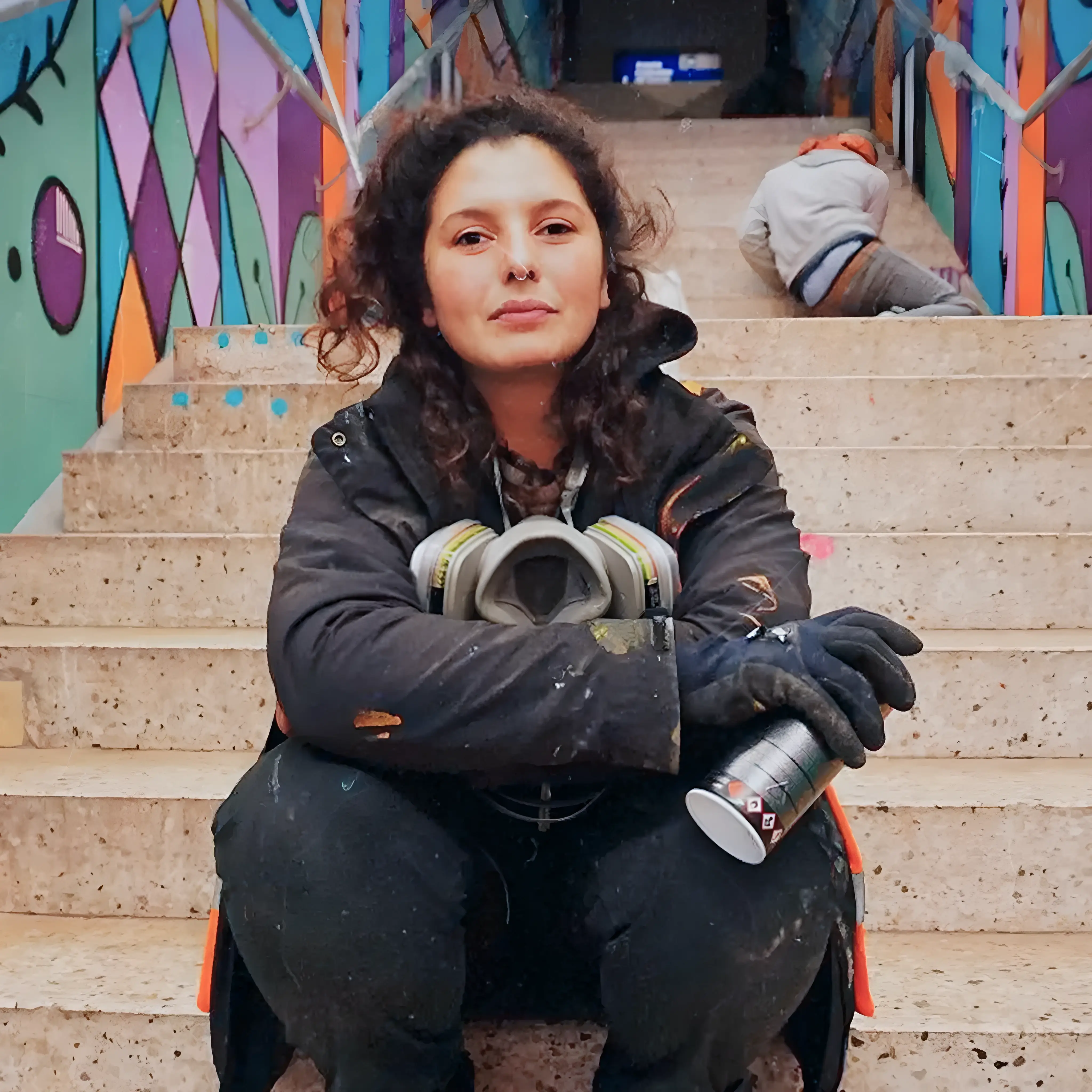
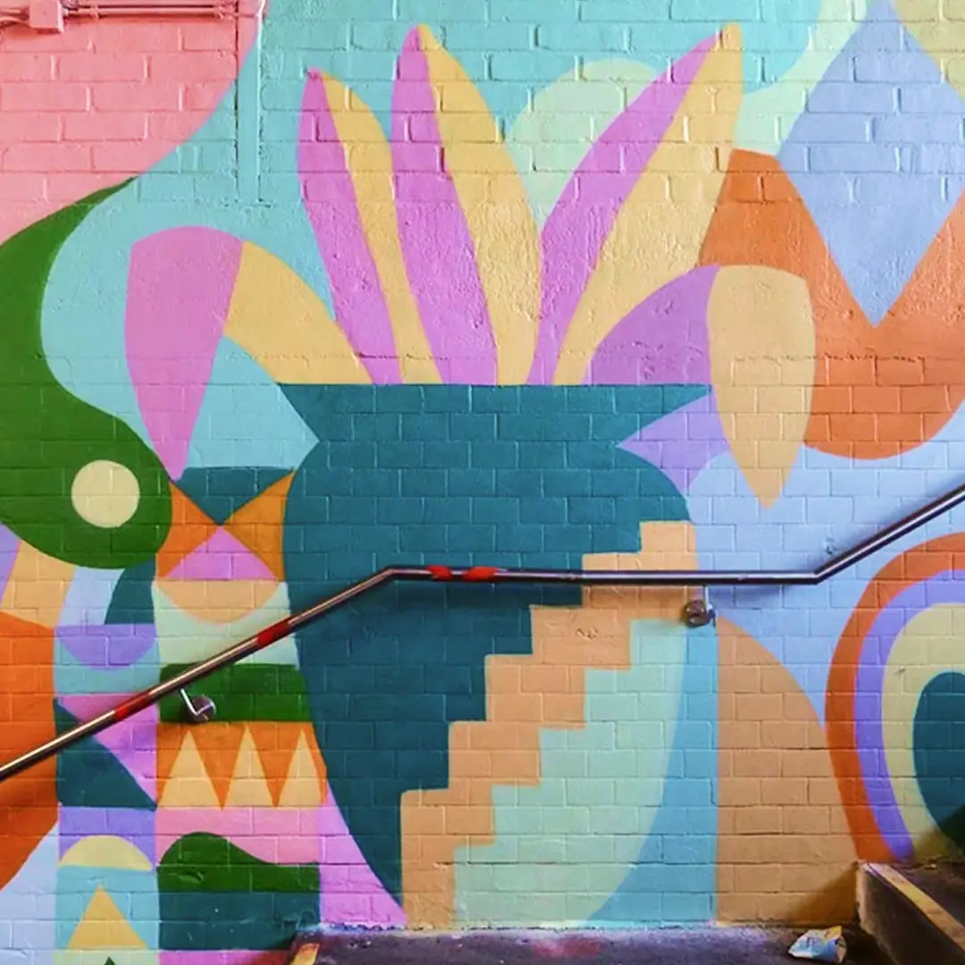
Commissioned work
Sitemap

Sitemap

Design Audit — Laying the Foundation For Responsiveness and Long-Term Maintainability
The initial PDF layout was designed for desktop only, with no mobile behavior or design logic defined. To adapt and extend it, I conducted a design audit and proposed:
UX improvements in structure and interaction
A Spacing rhythm using a 4px grid for consistency and clarity
A mobile-first approach optimized for all breakpoints
Design is not just what it looks like and feels like. Design is how it works. — Steve Jobs
Systematizing Design — Clear Structure and Reusable Logic
To ensure visual consistency and scalability, I applied a system-based approach across all breakpoints:
Typography and spacing systems based on design logic, optimized for readability across breakpoints
Section-based structure with reusable components
Modular WordPress theme with block-based logic
Colors
#fcbe03 — Sunny Yellow
#eedbce — Almond
#fff4eb — Spring Wood
#3b00cc — Expressive Blue
#f8ff1d — Fluorescent Yellow
#8823ff — Mesmerizing Purple
#FFFFFF — White
#000000 — Black
Typography


Animations — Adding Subtle, Meaningful Movement
Playful but minimal animations that support the artistic tone :
Interactive Lottie animations created from SVGs enhanced user participation and site personality
Smooth scroll behavior and interactive hover states
Page transitions that mimic preparing a blank canvas
Beauty and brains, pleasure and usability should go hand in hand. — Donald Norman
Results & Reflections — A Living, Scalable Digital Extension of Thekra’s Work
- System-based layout even for a small site
- Responsive, animated, and fully client-maintainable via CMS
Clear, written CMS guide so the client feels confident updating and growing the site
© Anna Saar, 2026
Text, images and code made with 💕and ☕
Text, images and code made with 💕and ☕
© Anna Saar, 2026