GRVL Series
Branding
A proposed redesign of the GRVL brand identity, created to support the series’ international growth with a scalable, recognizable, and human visual system
A scalable identity for a global gravel culture.
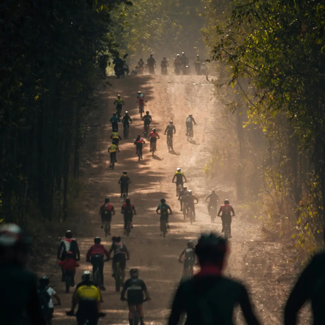
GRVL has grown into an international event series with a strong community spirit — but its visual identity needed a clearer, more scalable foundation to support growth across regions, seasons, and formats.
This project was developed as a collaboration/pitch to rethink the GRVL brand from the ground up: not as a one-off logo refresh, but as a system that could expand naturally with the series.
| Products | Brand identity for GRVL Series’s marketing assets, website and merchandise |
| Role | Brand strategy · Logo & identity design · Typography & color systems · Modular visual systems |
| Skills | Design systems strategy, Figma component architecture, Token logic, Multi-platform design, Design documentation, Design–developer collaboration |
| Team | Anna Saar |
| Client | GRVL Series |
Challenge — Creating a recognizable identity that grows with the series
As a fast-growing e-bike company, Ampler Bikes needed a scalable design system that could support multiple digital touchpoints and ensure consistency, efficiency, and scalability. The goal was to create a scalable, consistent, and efficient design system that worked seamlessly across their three core products:
Project Roadmap
1
Brand Audit
Identifying what already resonated and where consistency broke
2
Core Identity Design
logo, wordmark, and scalable mockups
3
System Definition
Typography, color logic, and modular rules
4
Real-world validation
Applying the system to realistic brand touchpoints
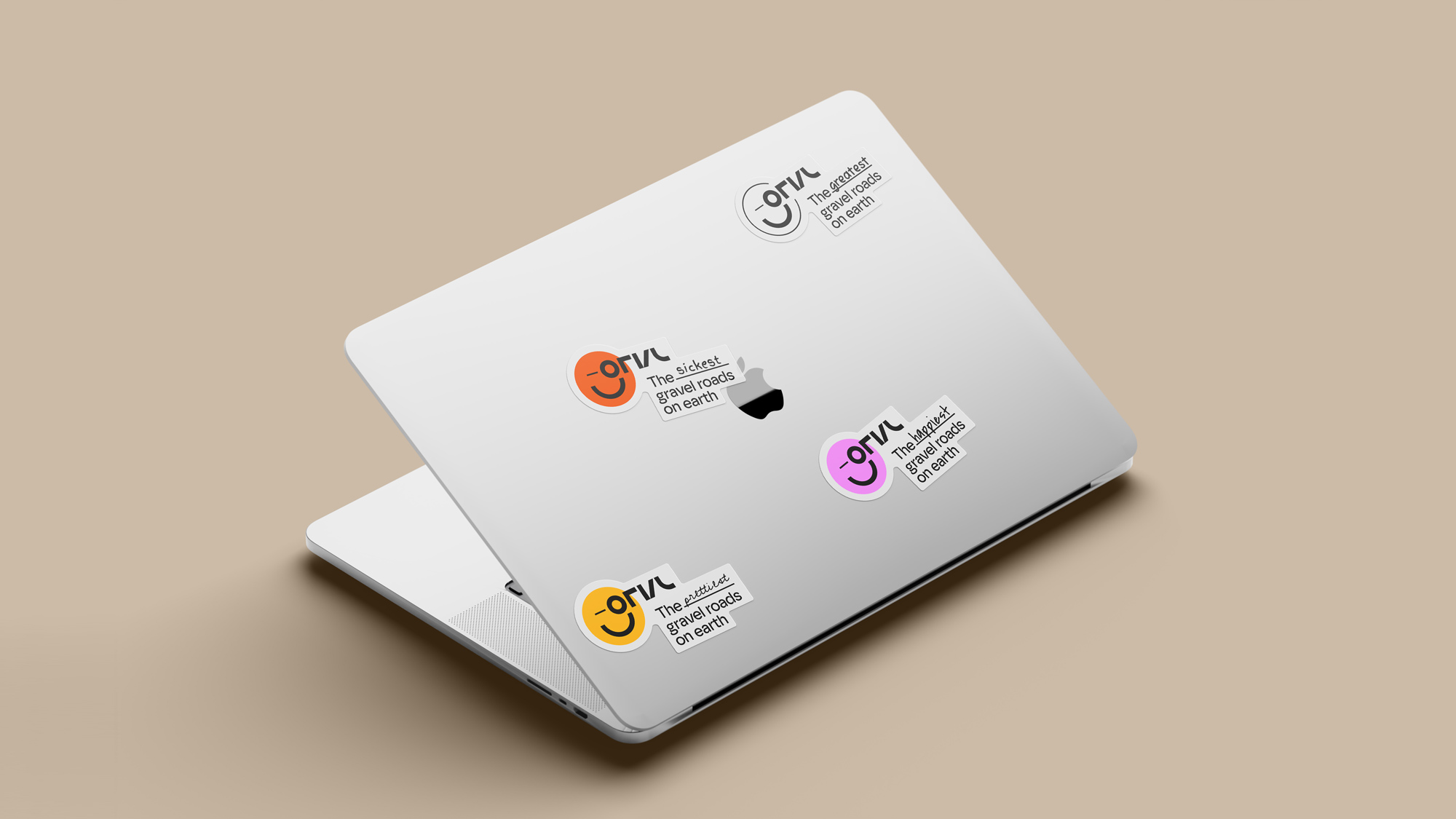
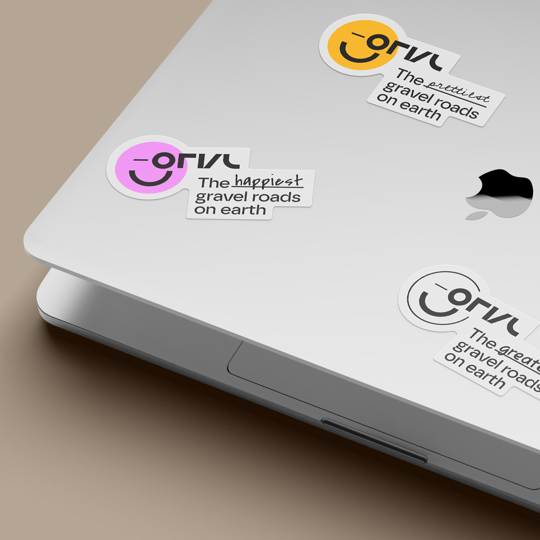
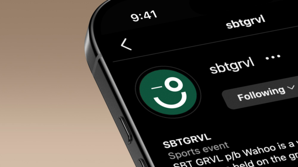
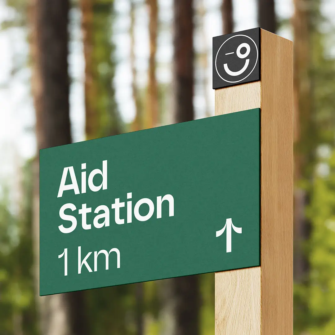
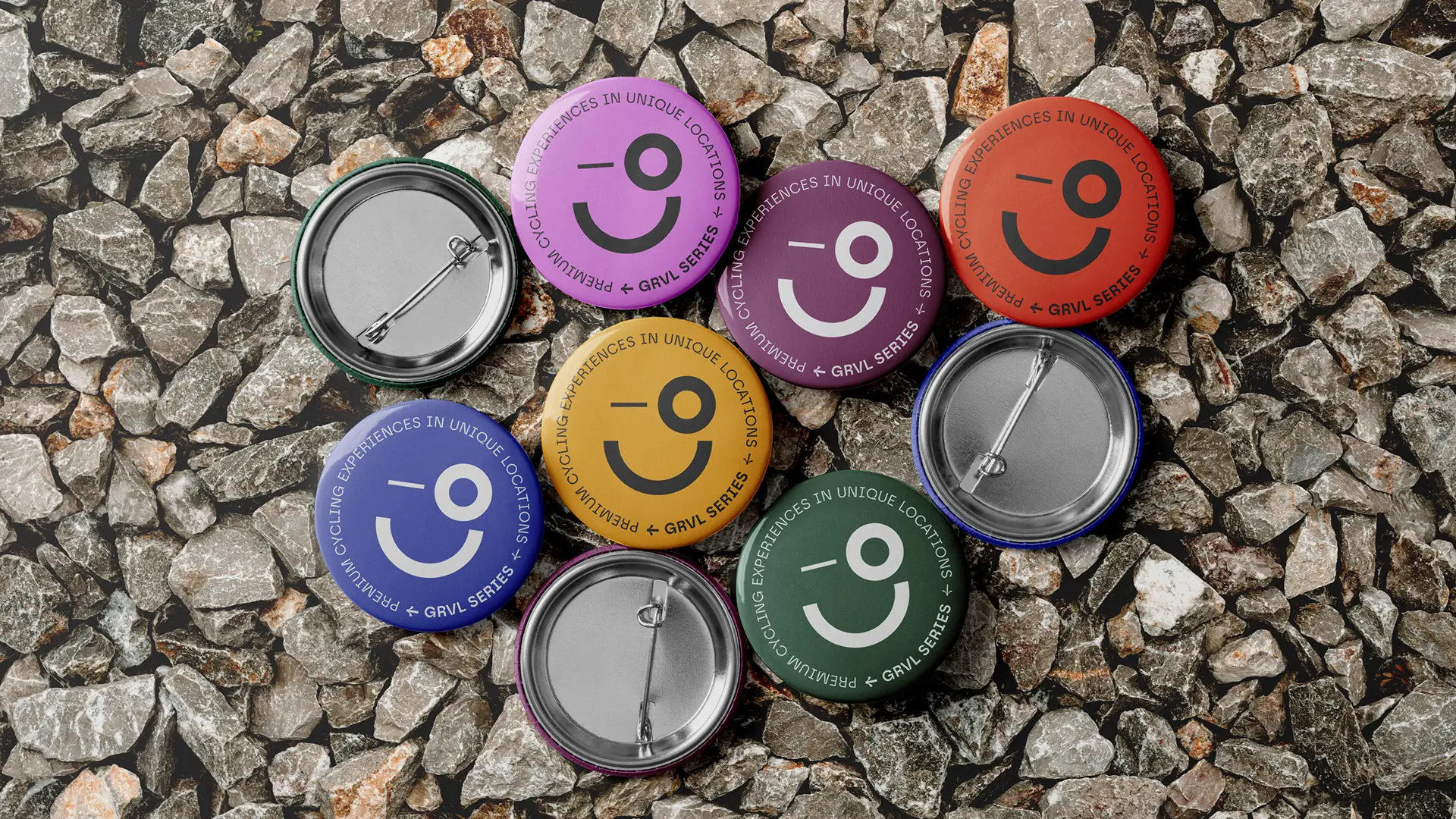
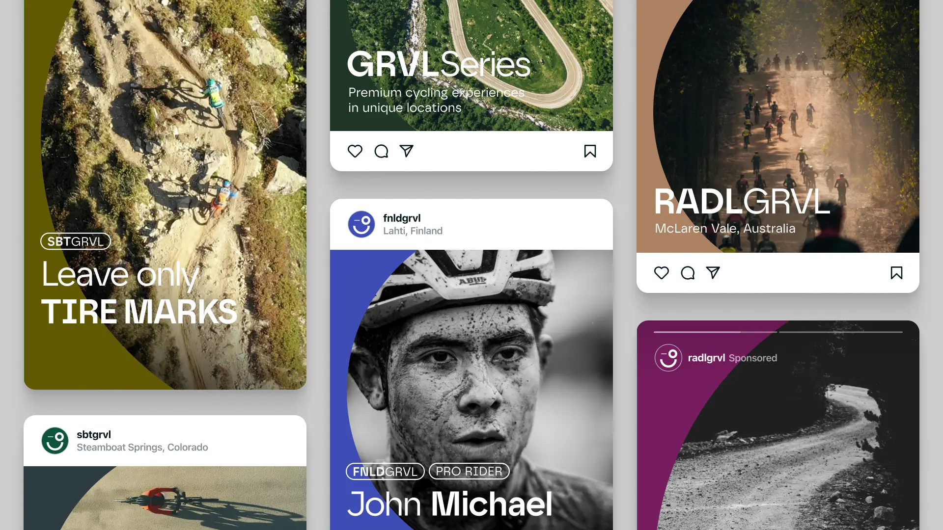
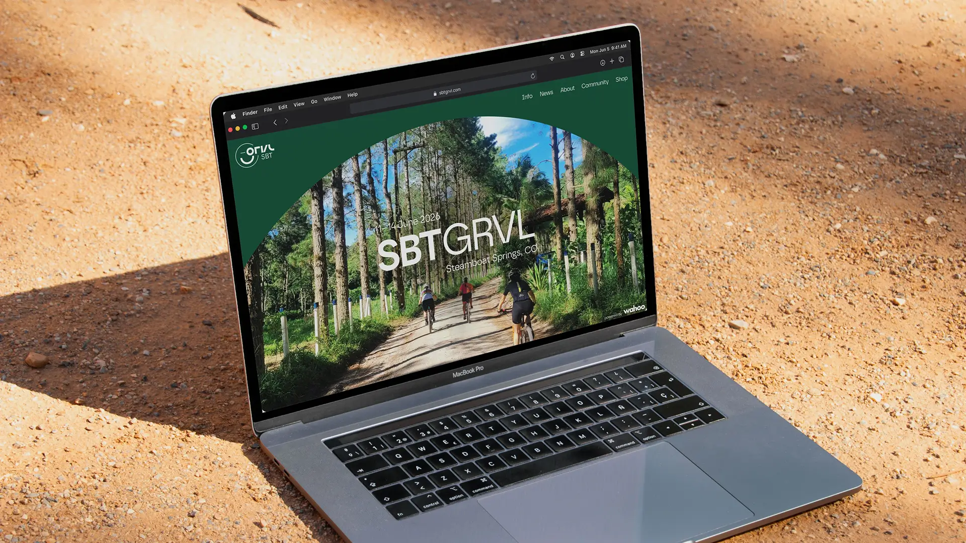
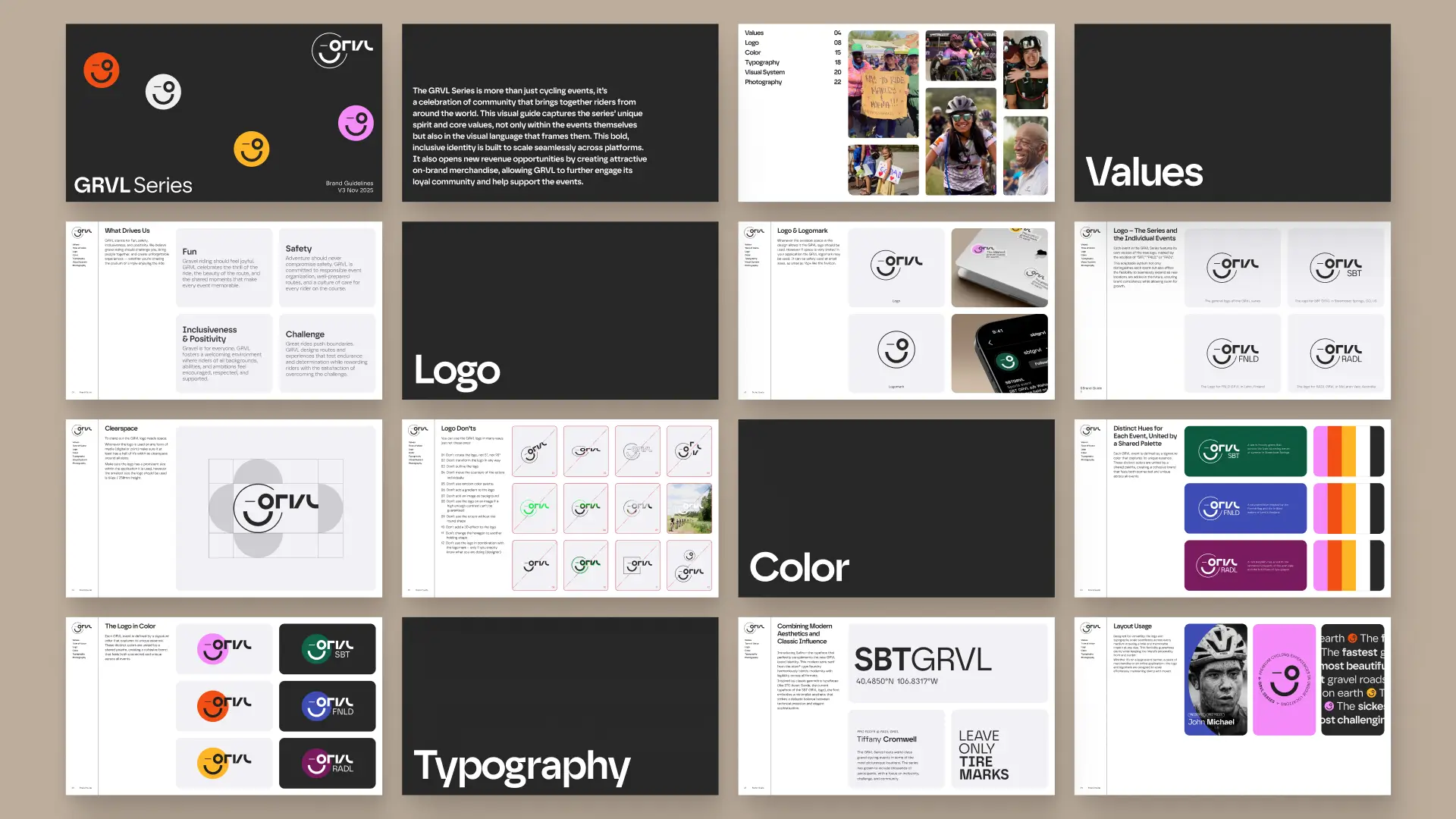
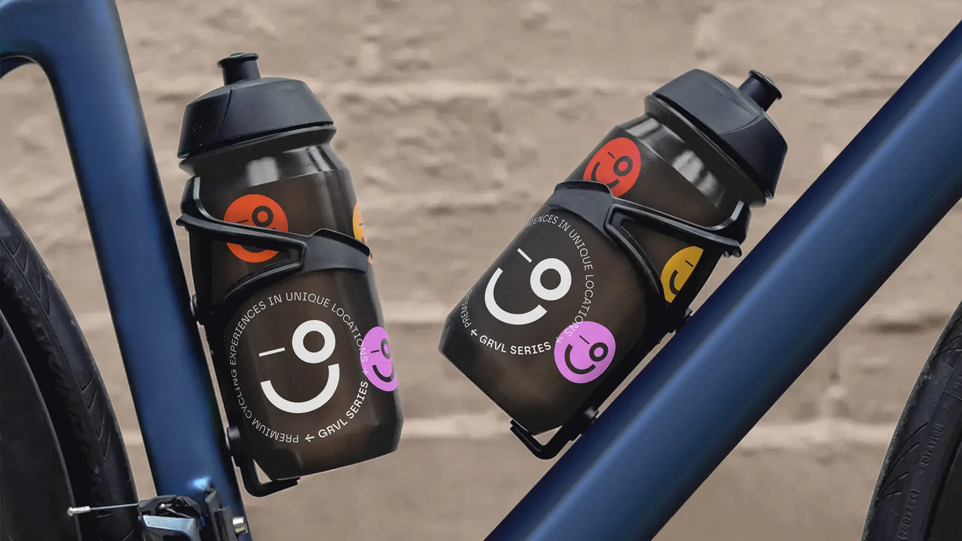
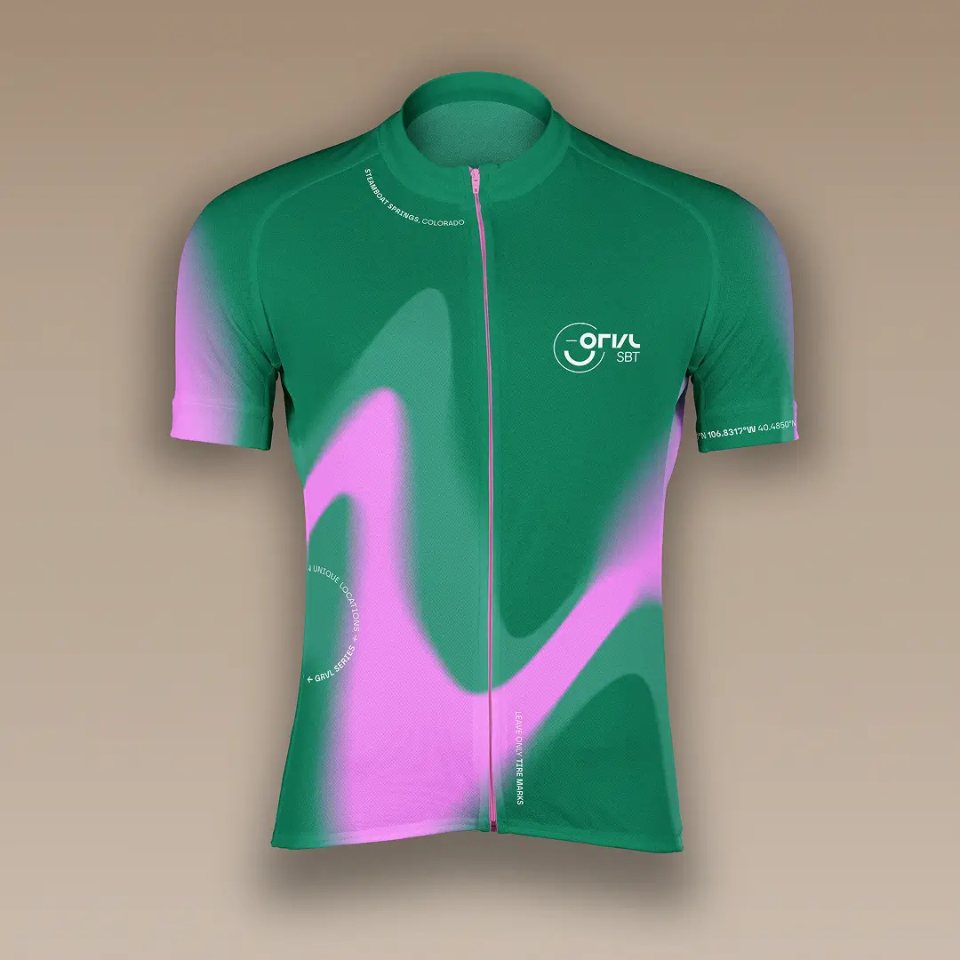
Solution — A logo-led system built for consistency, flexibility, and personality
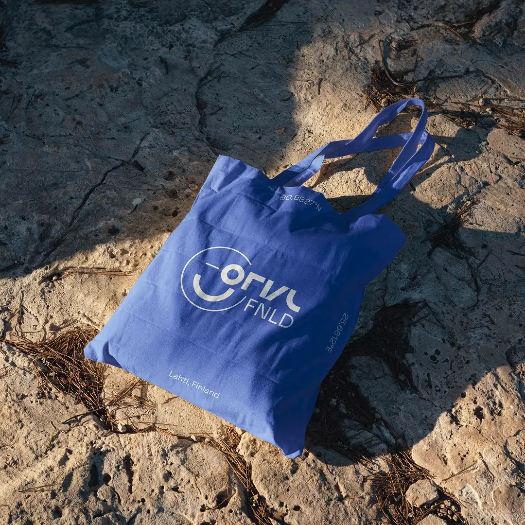
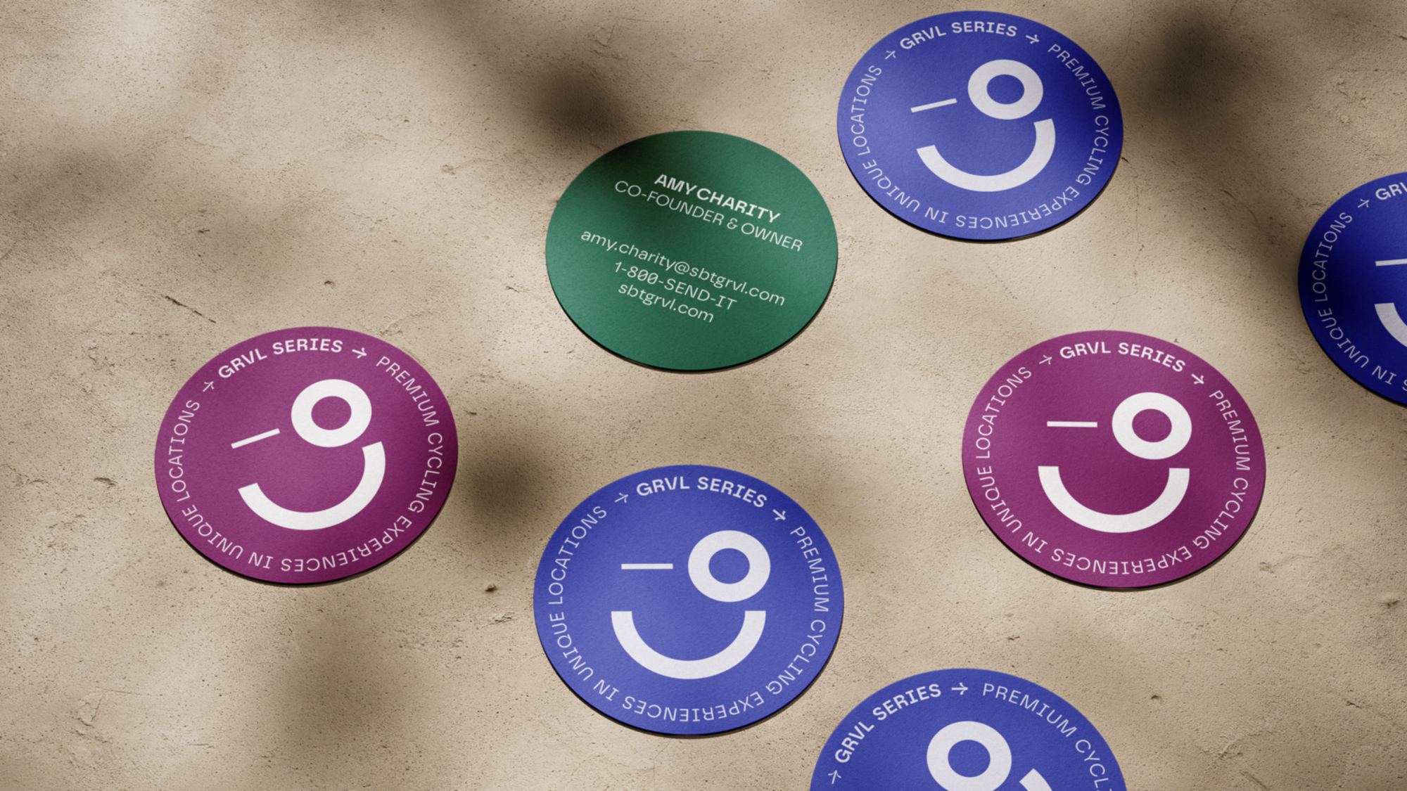
The new logo is centered on the people of GRVL—participants, organizers, and the entire team. It captures the event’s positive spirit, reflecting the energy and unity sparked by each person’s unique contribution as they come together to create an unforgettable experience.
Logomark— Ampler Companion App

Logomark— Ampler Companion App
Process — From brand audit to modular identity framework
When I started building Ampler's design system, Figma offered no component variants or variables. I began establishing a foundation of reusable components and created a structured design library in Figma. Later, I extended it with variants and variables as Figma evolved. The system grew into:
- Primitives: colors, spacing, typography, elevation
- Components: buttons, forms, navigation, cards
- Patterns: layouts, bike configurator flows, app dashboards
Color — Marketing & E-commerce Website
#0E543C — Forest Green
A warm, foresty green that echoes the lush, blooming nature of summer in Steamboat Springs, Colorado.
#3e4cb4 — Lake Blue
A saturated blue inspired by the Finnish flag and the brilliant waters of Lahti’s Vesijärvi.
#771c5e — Deep Ruby
A rich purplish-red, a nod to the renowned vineyards of McLaren Vale and the bold hues of ripe grapes.
Typography — Ampler Companion App
Visual System — Ampler Companion App
Documentation — Ampler Companion App
Core Styles


Impact — A future-proof foundation for events, merchandise, and growth
For the system to work across three platforms solutions included:
- Shared design principles across all surfaces
- Flexible component variants
- Simplified type and icon sizes for LCD
© Anna Saar, 2026
Text, images, code made with 💕and ☕
Text, images, code made with 💕and ☕
© Anna Saar, 2026