A complete redesign of the GRVL Series brand identity to create a more cohesive, scalable, and inclusive visual system. The goal was to enhance recognition across all touchpoints while keeping the brand playful, bold, and accessible to the diverse gravel cycling community.
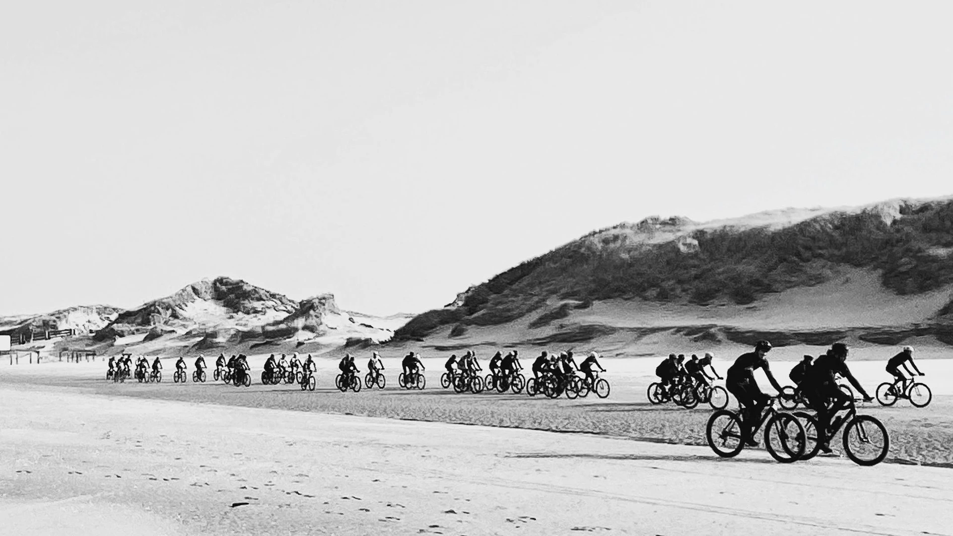
Logo — Brought to life by every participant.
The new logo is centered on the people of GRVL—participants, organizers, and the entire team. It captures the event’s positive spirit, reflecting the energy and unity sparked by each person’s unique contribution as they come together to create an unforgettable experience.
Logo
The new GRVL logo brings the brand to life with a clever twist—the “g” doubles as a winking smiley, capturing the fun, inclusive spirit of the gravel riding community.
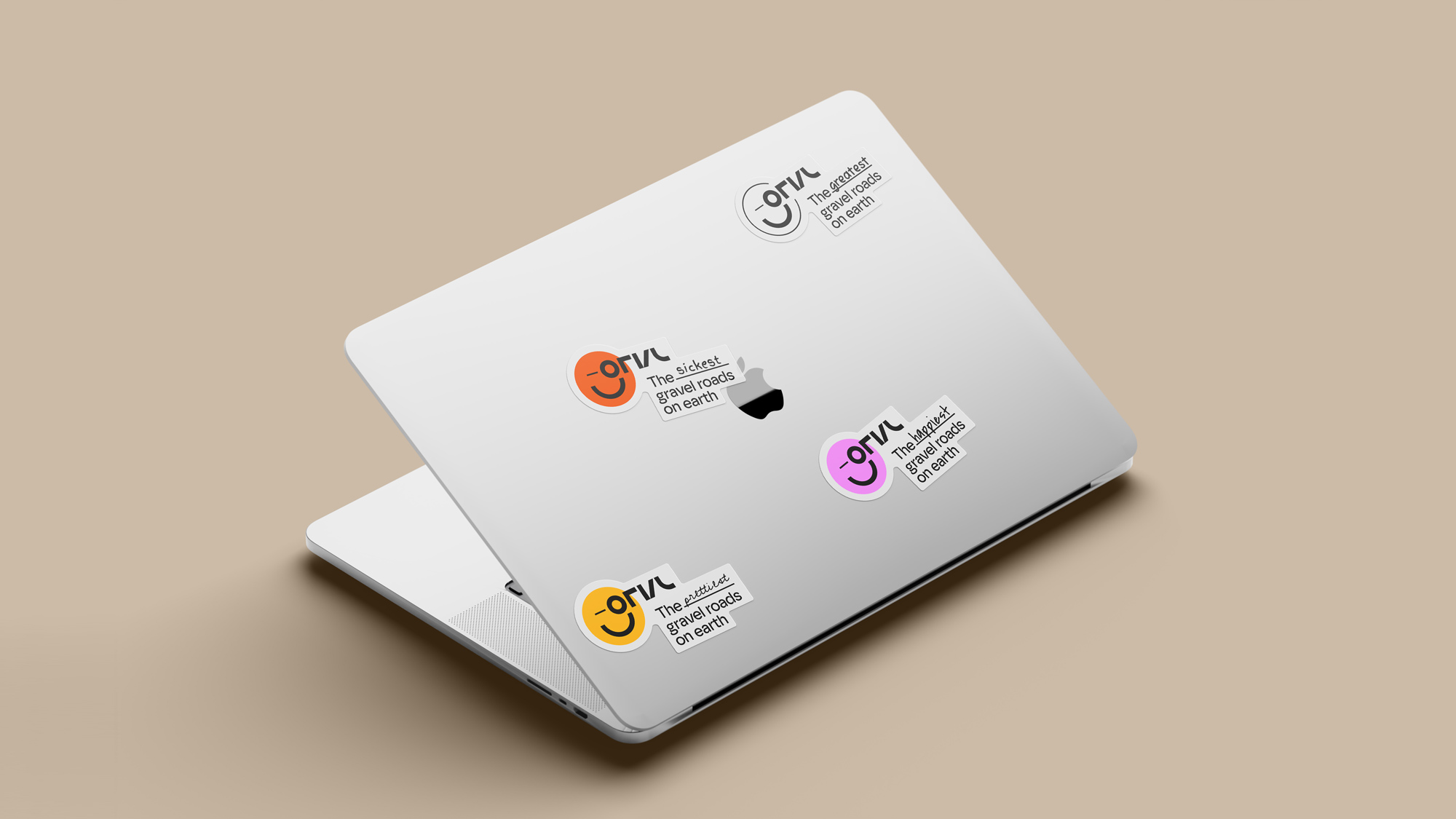
Logomark
Used when space is limited or for specific stylistic reasons. It’s suitable for small applications due to its clarity at reduced sizes.
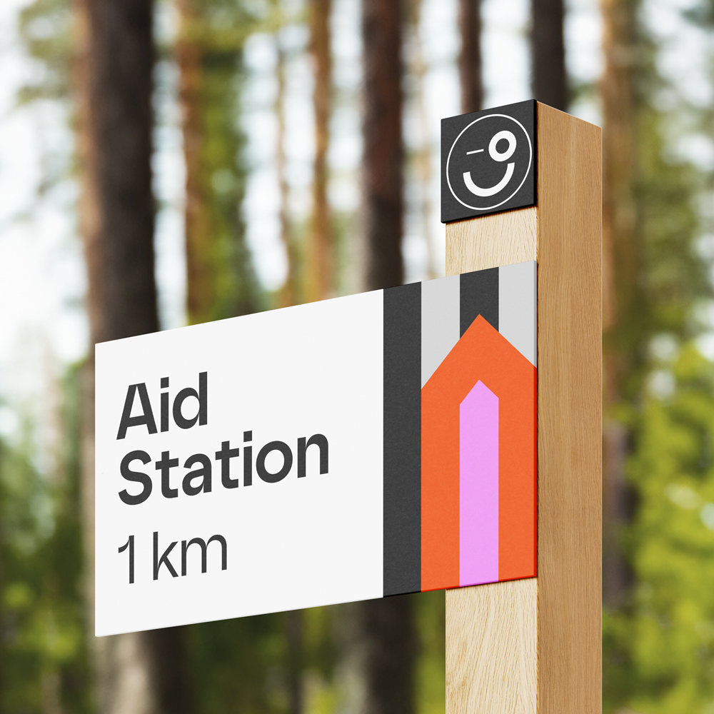
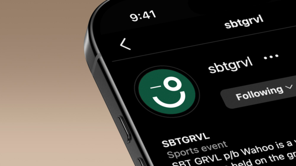
The Events — Brand consistency while allowing room for growth.
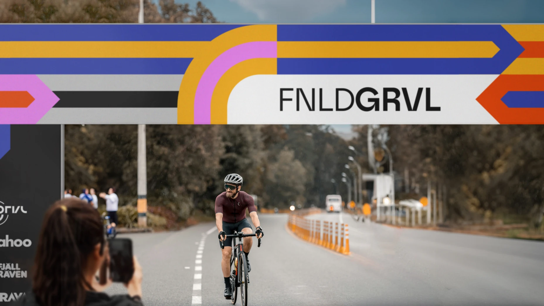
Each event in the GRVL Series features its own version of the new logo, marked by the addition of “SBT,” “FNLD,” or “RADL”. This adaptable system not only distinguishes each event but also offers the flexibility to seamlessly expand as new locations are added in the future.
The general logo of the GRVL Series.
The logo for the SBT GRVL event, hosted in Steamboat Springs, Colorado, US.
The Logo for the FNLD GRVL event, hosted in Lahti, Finland.
The logo for the RADL GRVL event, hosted in McLaren Vale, South Australia.
Color — Distinct hues for each event, united by a shared palette.
Each GRVL event is defined by a signature color that captures its unique essence. These distinct colors are united by a shared palette, creating a cohesive brand that feels both connected and unique across all events.
#F48AF8 — Forest Green
A warm, foresty green that echoes the lush, blooming nature of summer in Steamboat Springs, Colorado.
#3E4CB4 — Lake Blue
A saturated blue inspired by the Finnish flag and the brilliant waters of Lahti’s Vesijärvi.
#771C5E — Deep Ruby
A rich purplish-red, a nod to the renowned vineyards of McLaren Vale and the bold hues of ripe grapes.
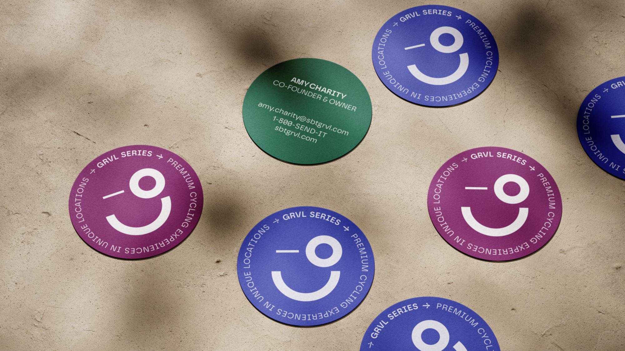
Typography — Combining Modern Aesthetics and Classic Influence
Safiro perfectly complements the new GRVL brand identity. Inspired by classic geometric typefaces the font embodies a minimalist aesthetic that strikes a delicate balance between technical precision and elegant sophistication – just like a GRVL rider.
© Anna Luise Skopp, 2024
Text, images, code made with 💕and ☕
Text, images, code made with 💕and ☕
© Anna Luise Skopp, 2024