Ampler Bikes
Rebranding
Ampler is an Estonian e-bike brand (founded in 2014) that makes lightweight, minimalist urban electric bikes. By 2022 it had grown from a garage startup into a fast-scaling direct-to-consumer company. Ampler’s core values are simplicity, sustainability and the joy of commuting. The brand lacked a unified visual identity and design framework across its growing business. The rebranding scope streched across all marketing materials as well as web, app, product, packaging and retail.
| Deliverables | Complete brand identity & design system (logo, palette, guidelines) for Ampler’s e-bikes, website/app and marketing assets |
| Role | Lead Brand & UI Designer |
| Key Skills | Brand strategy, Visual & Interaction Design; UX research, UI/UX prototyping, Campaign & Content creation |
| Team | Ampler Design Department (Anna Skopp, Tobias Textor, Kaur Kask, Jörgen Kursk), CMO, and leadership to align on strategy and creative |
| Client | Ampler Bikes |

Task — From startup to scale-up
Ampler’s challenge was to unify and modernize its brand as it scaled. The goal was a consistent, scalable identity that would increase awareness in new markets and support more products, as a new bike lineup was imminent.
Project Roadmap
1
Discover & Strategize
Run takeholder workshops and user research to define main rider personas
Audit existing materials to understand gaps and strengths
Define brand positioning
2
Brand Development & Documentation
Build a visual and verbal language aligned with rider personas
Design a refined logo, cohesive color palette, and timeless typography
Documentation in a brand book
3
Digital Design & Documentation
Creat a UI design system in Figma for web, app, and on-bike display
Unify layouts, components, and interaction patterns for all digital touchpoints
Apply the new visual identity across key screens for a seamless rider experience
4
Rollout
Launch the refreshed brand across campaigns, packaging, and retail
Update marketing materials, social ads, and citylight posters for major markets
Redesign showrooms and display units to create immersive brand spaces
Persona — Defineing Ampler’s Core Audiences
First Ampler’s audiences needed to be defined in order to apply their needs to branding and other touchpoints.
The Rebrand — A Contemporary Scalable Brand Design
Before


After


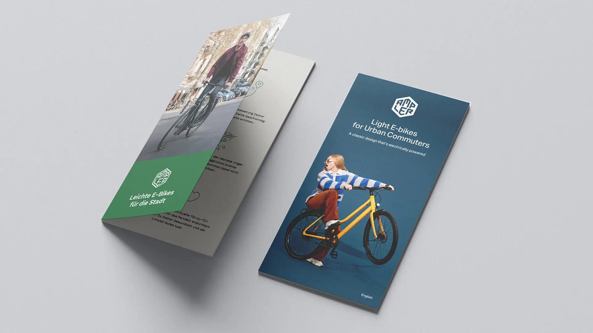
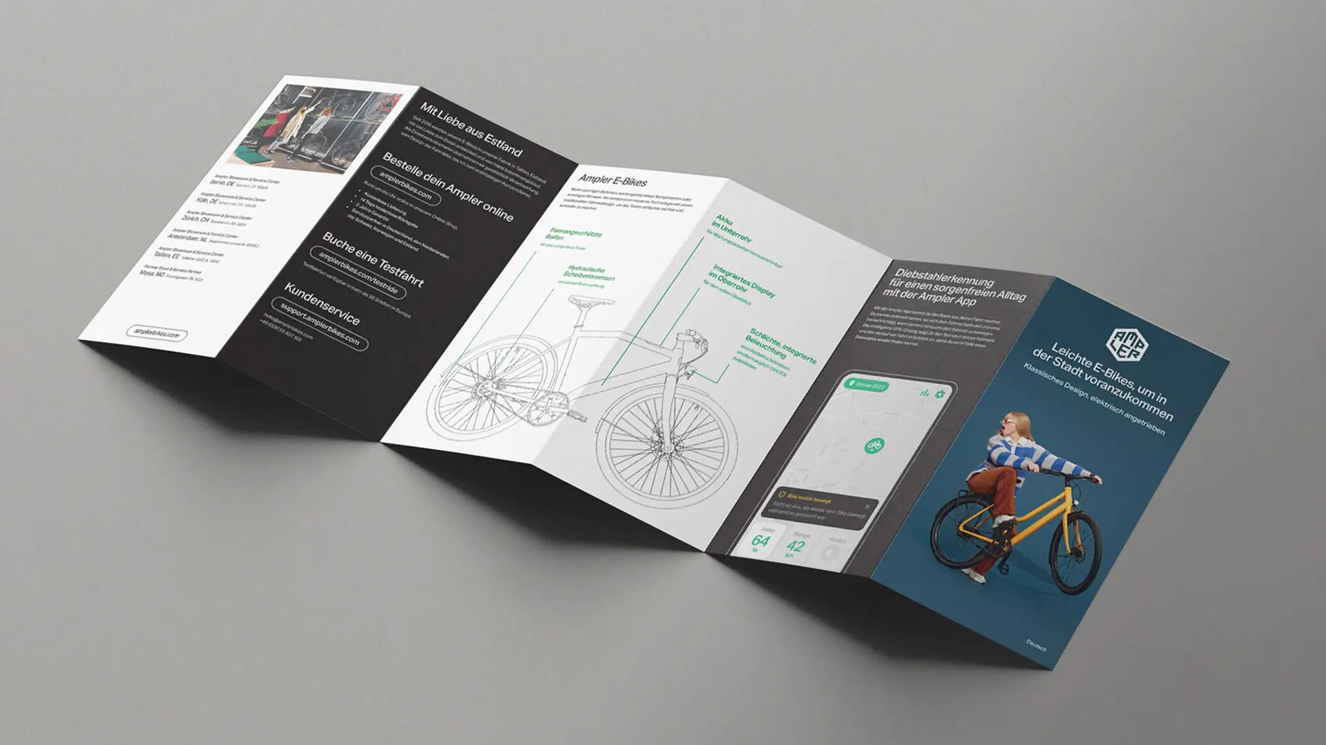
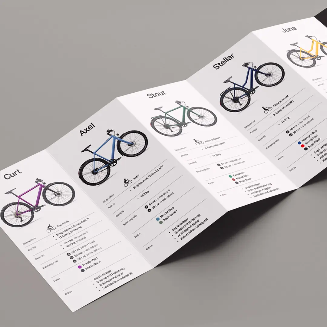
E-bike brochure before and after the rebrand
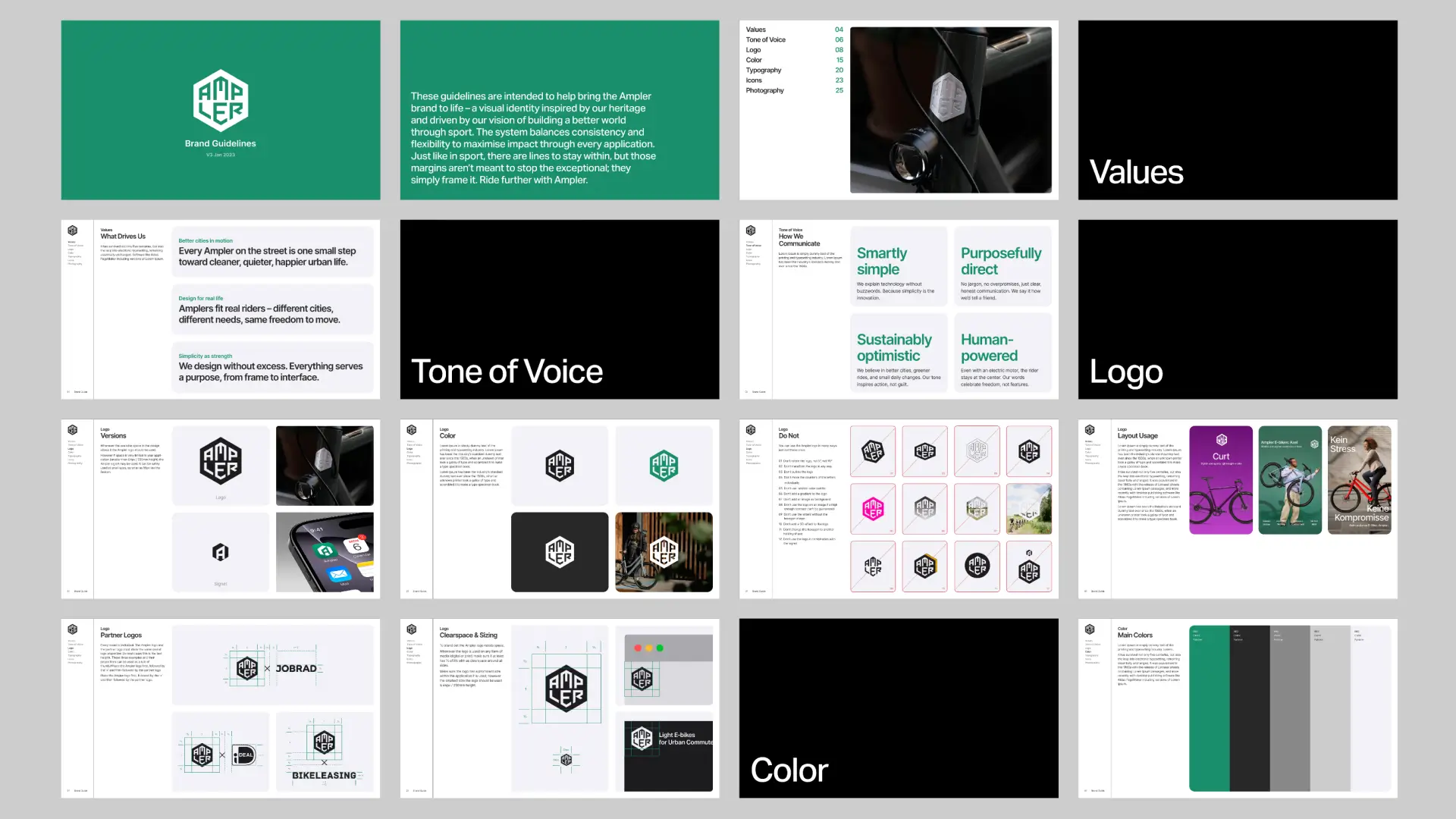
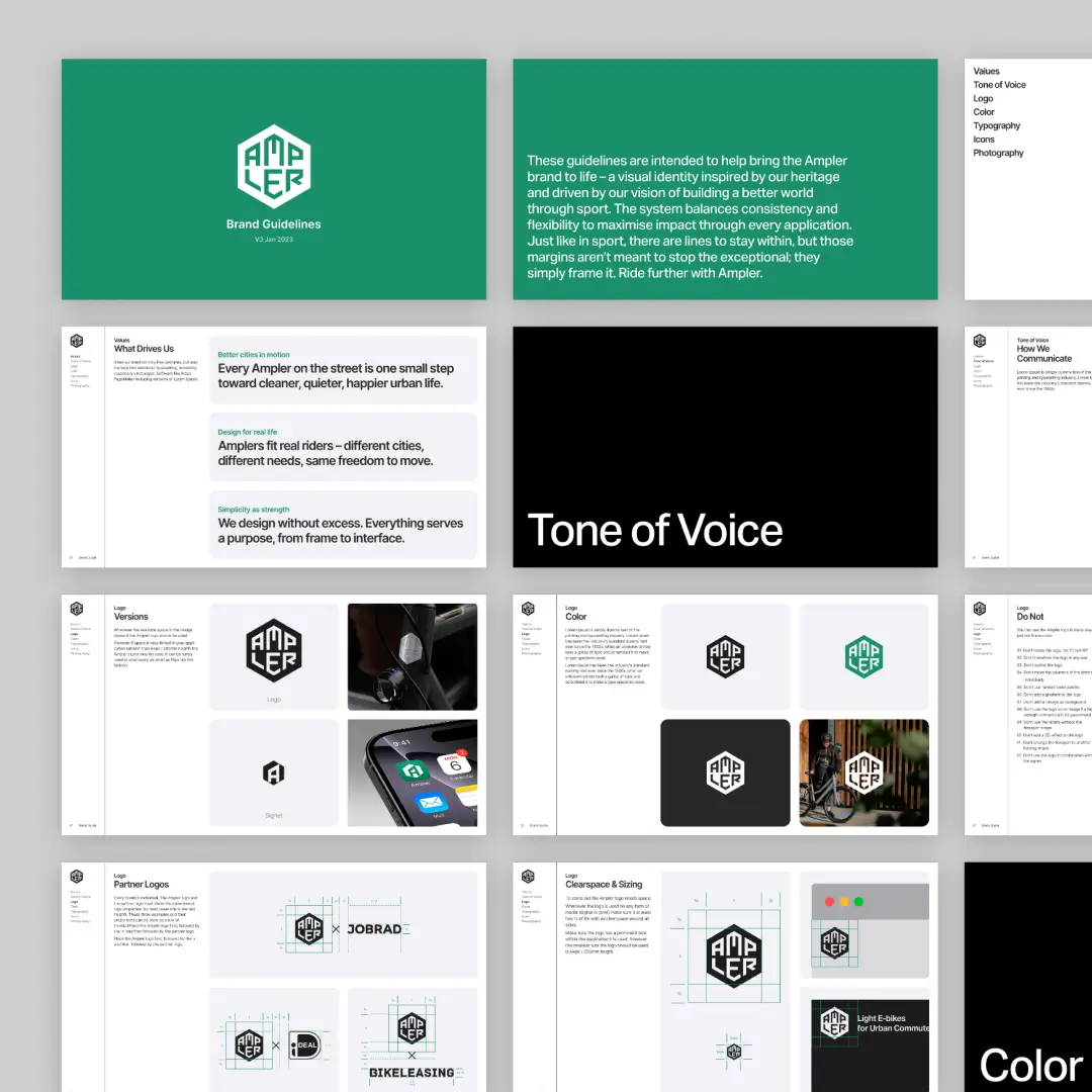
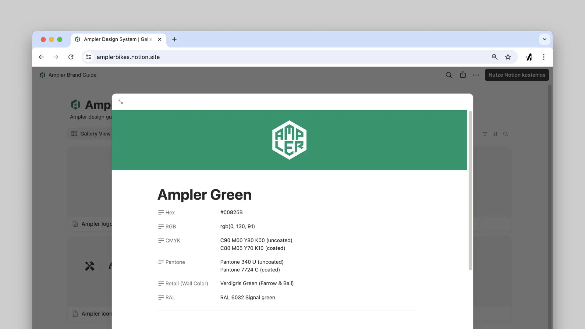
Documentation for Collaboration — A Shared Source of Truth
To make Ampler’s new brand easy to maintain and scale, all assets were documented in two formats: a comprehensive brand PDF as well as a Notion-based hub.
Since Ampler already used Notion for project management, the system became a central access point where design, marketing, and product teams could find up-to-date guidelines, download assets, and share documentation with creatives.
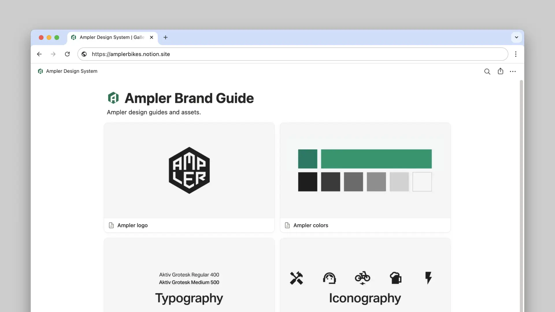
Ampler's brand documentation in Notion
Results — A unified brand identity fueling expansion and recognition
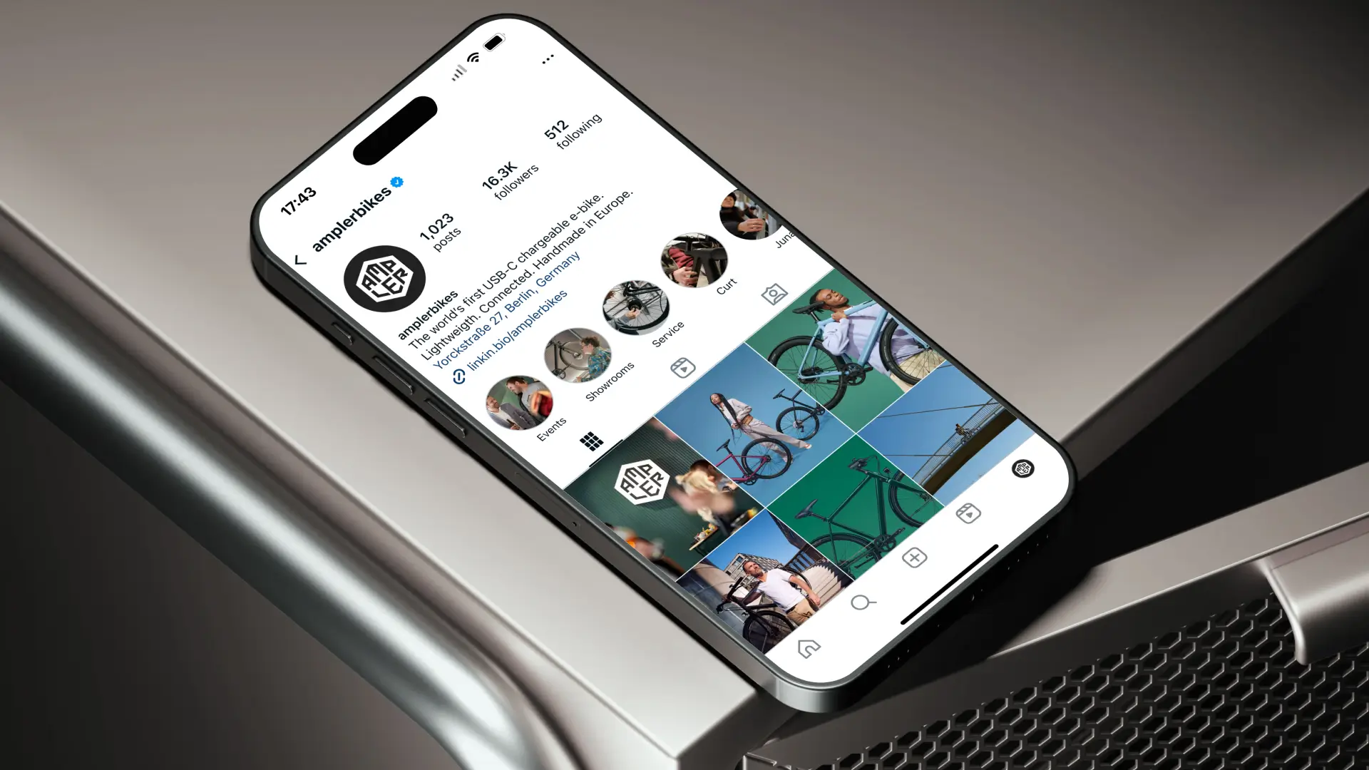
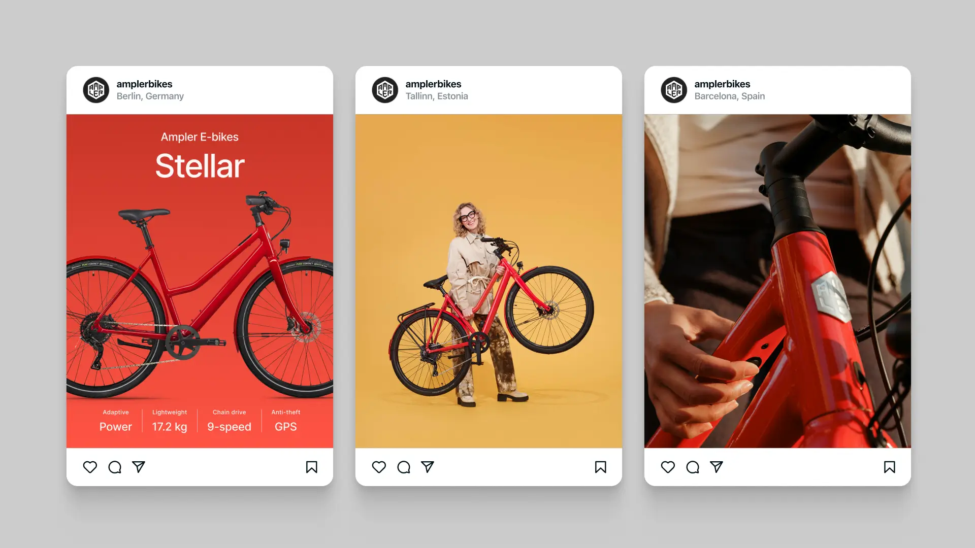
Social Media — Paid and Organic Campaigns
A unified social strategy aligned with our new personas was created. By aligning paid and organic content, reach and engagement were maxized. The campaigns emphasized the ease and joy of riding Ampler bikes, which helped grow Ampler’s follower base and drove traffic to the website.
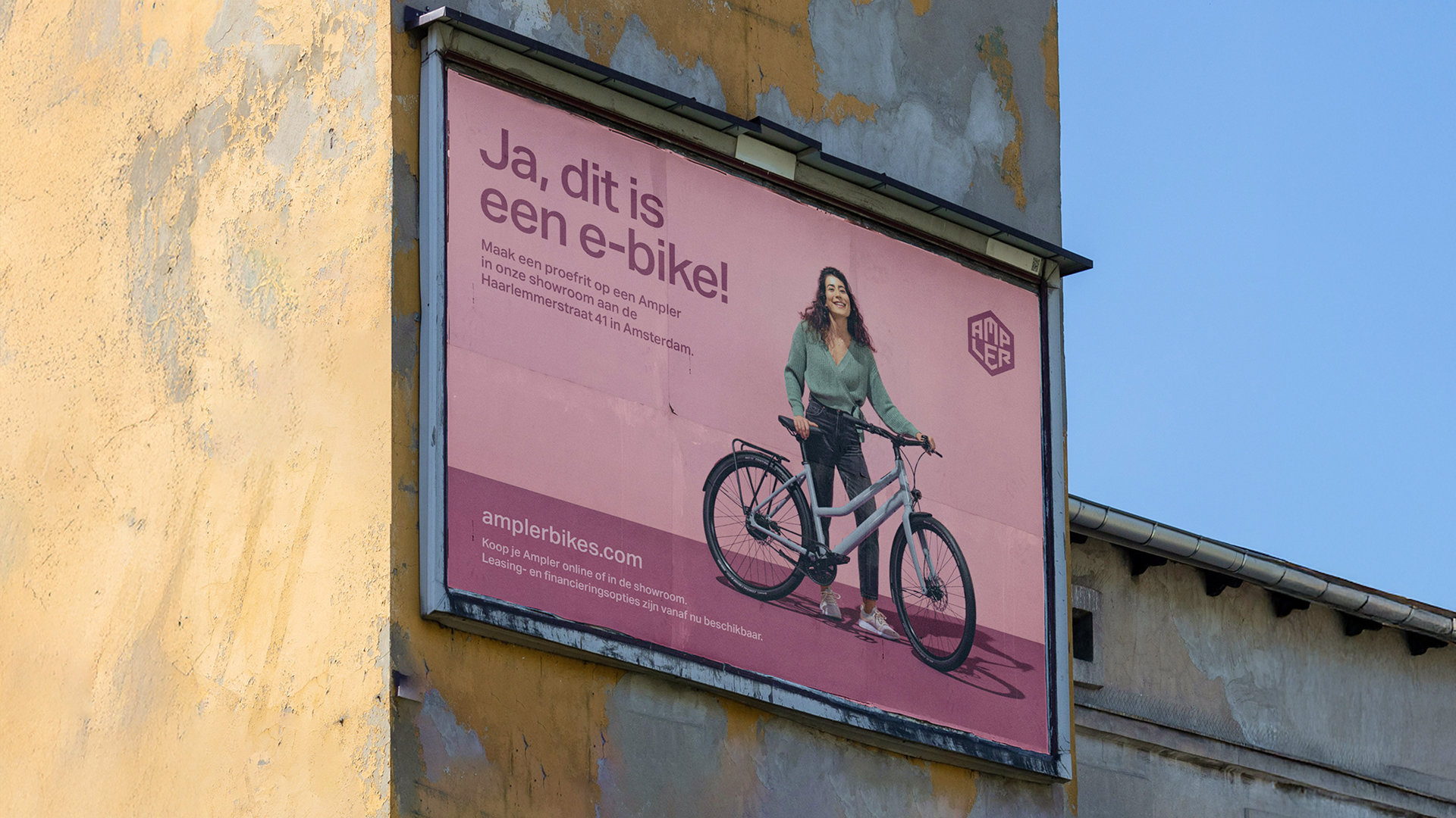
Outdoor Media — Citylight & Billboard Campaigns
To improve local brand awareness, citylight posters and billboards with simple, high-impact designs were placed in key cities of our market. These OOH ads were placed by transit hubs and bike paths to target urban commuters on their way to work.
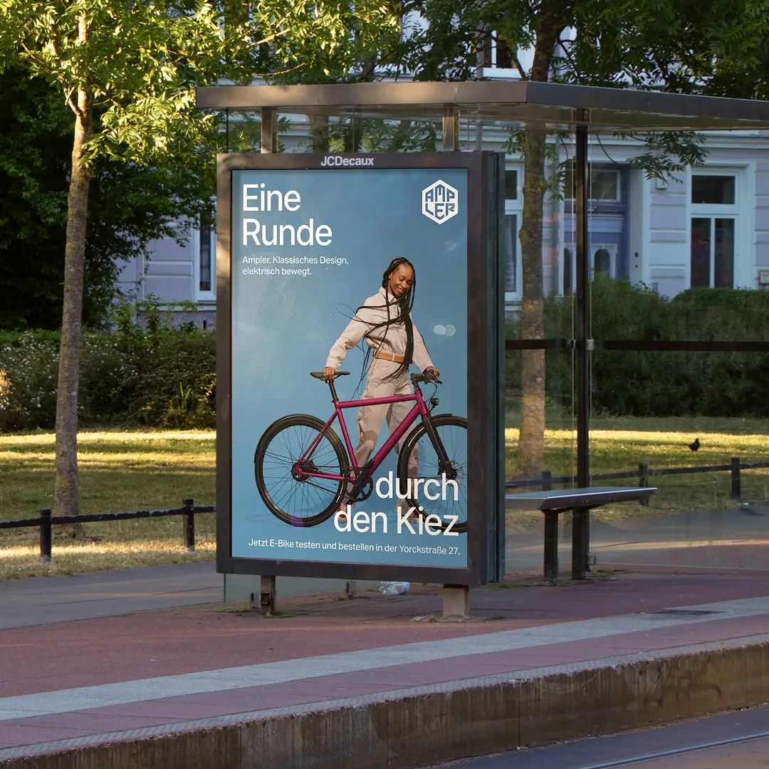
Berlin OOH campaign

Rotterdam OOH campaign
Packaging & Stationery — Crafted Brand Experiences at Every Touchpoint
The brand was applied to every physical detail: bike boxes, user manuals, stationary items and accessories now carry the new logo and color palette. These cohesive, on-brand materials ensured that unboxing an Ampler bike or opening a letter from the company feels like a continuation of the brand promise.


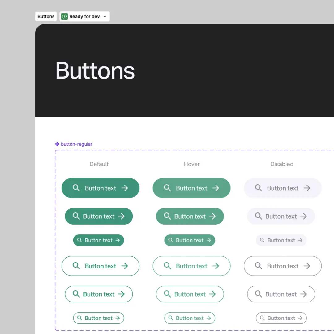
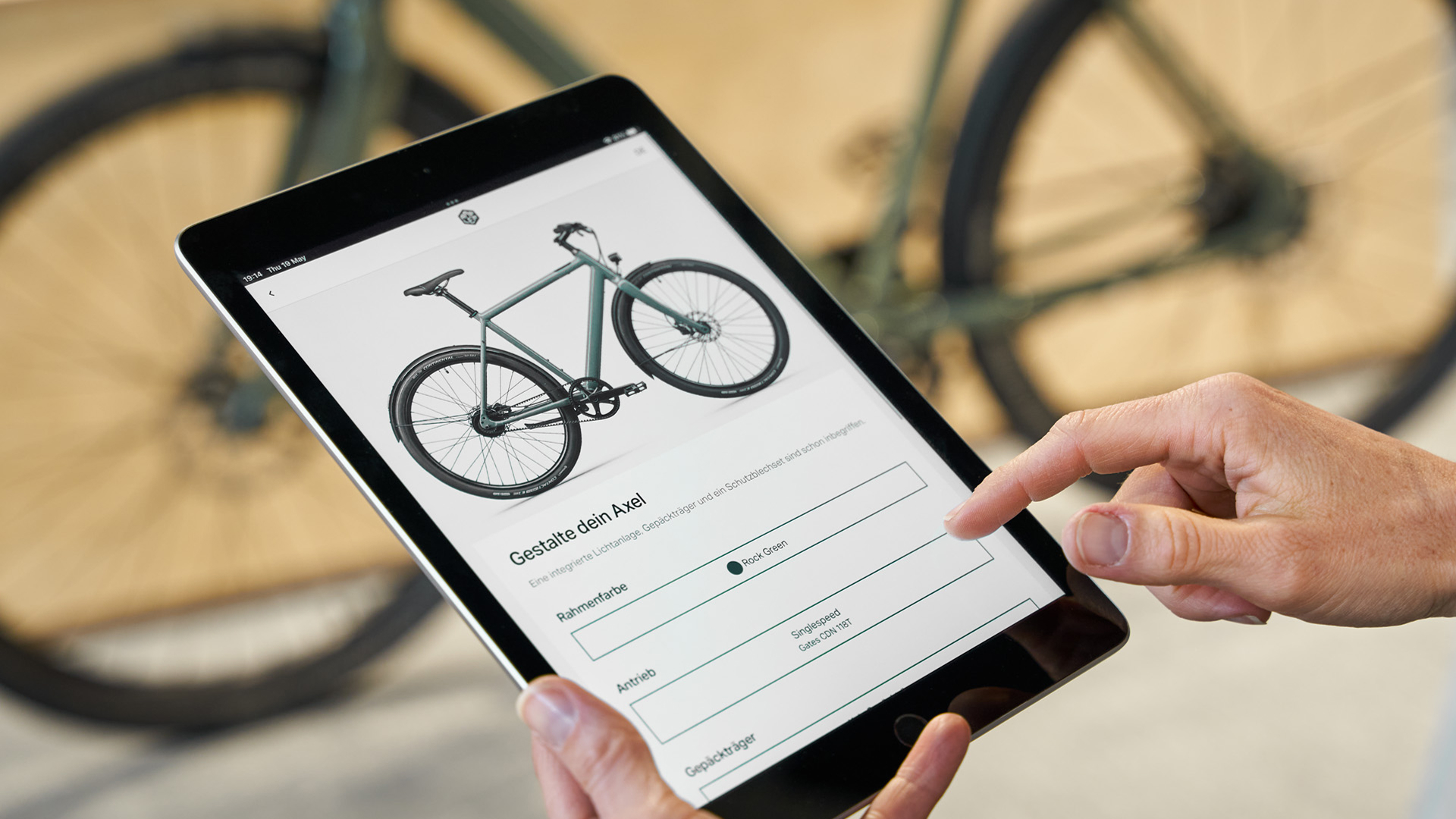
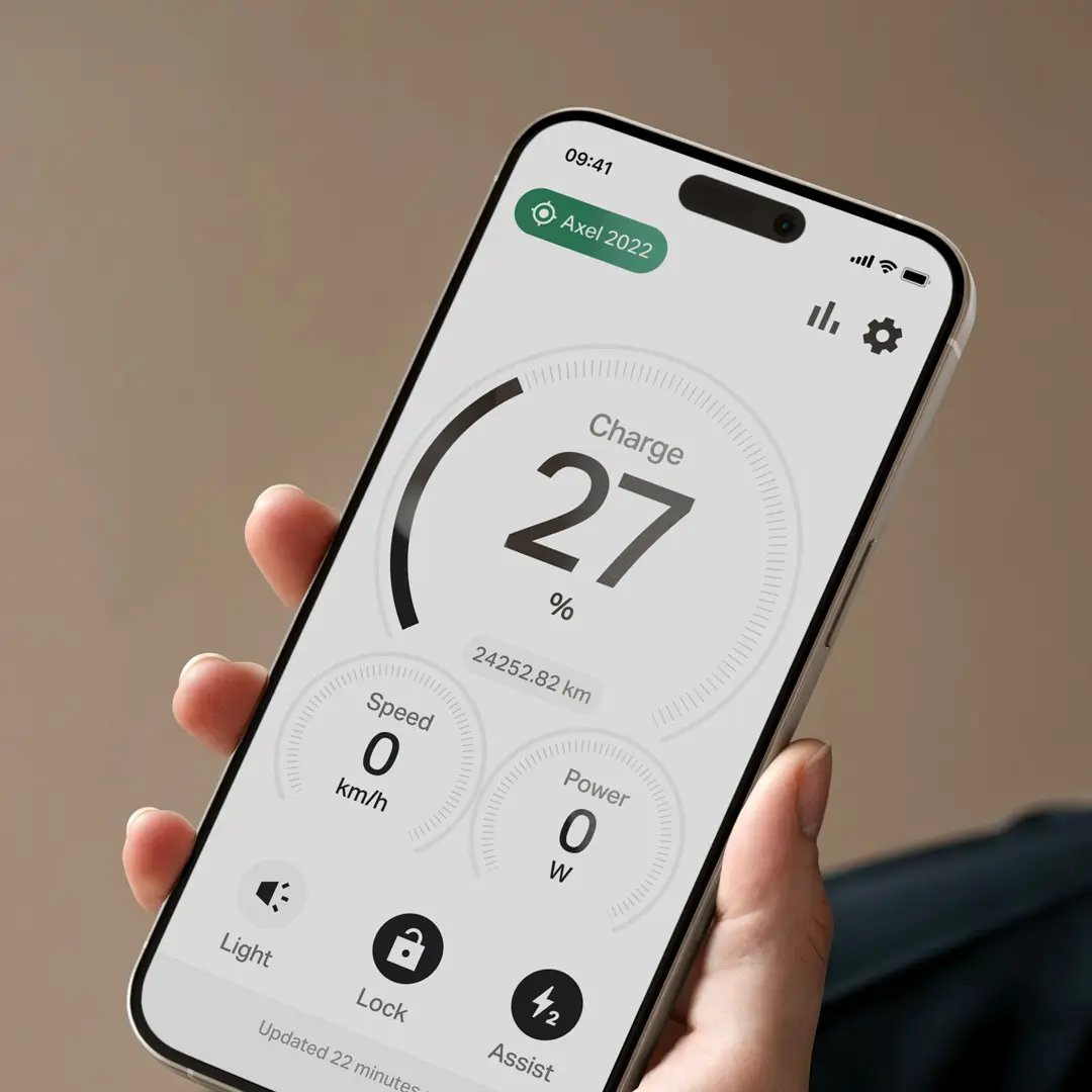
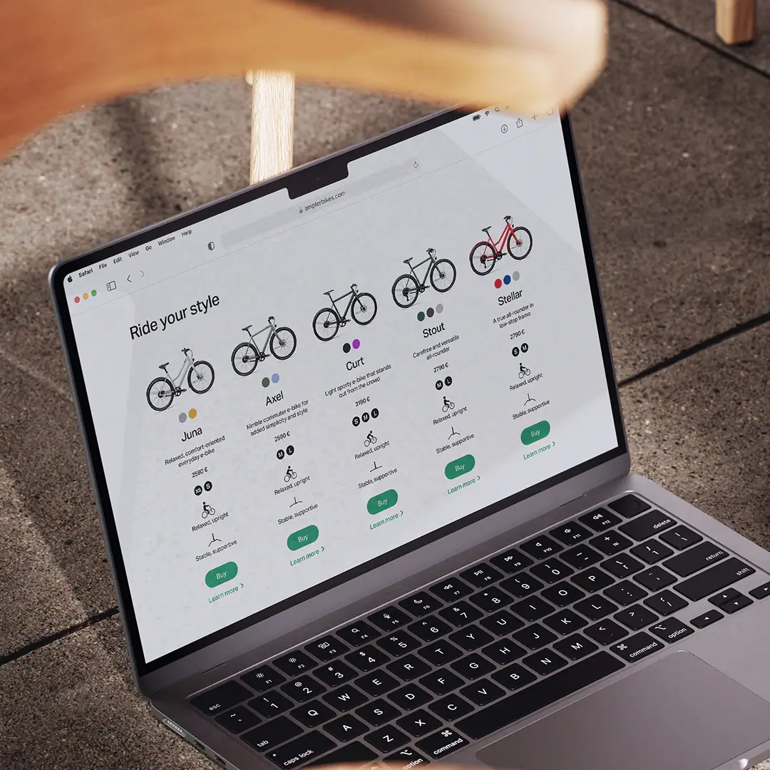
Digital Platforms — UI Design for Web, App and On-Bike Display
A proper design system was developed to streamline UI, ensuring every screen – from desktop to on-bike LED display – looks coherent and is easy to update. All digital touchpoints now shared the new look-and-feel.
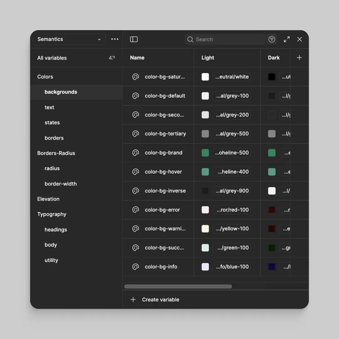
Figma variable collection

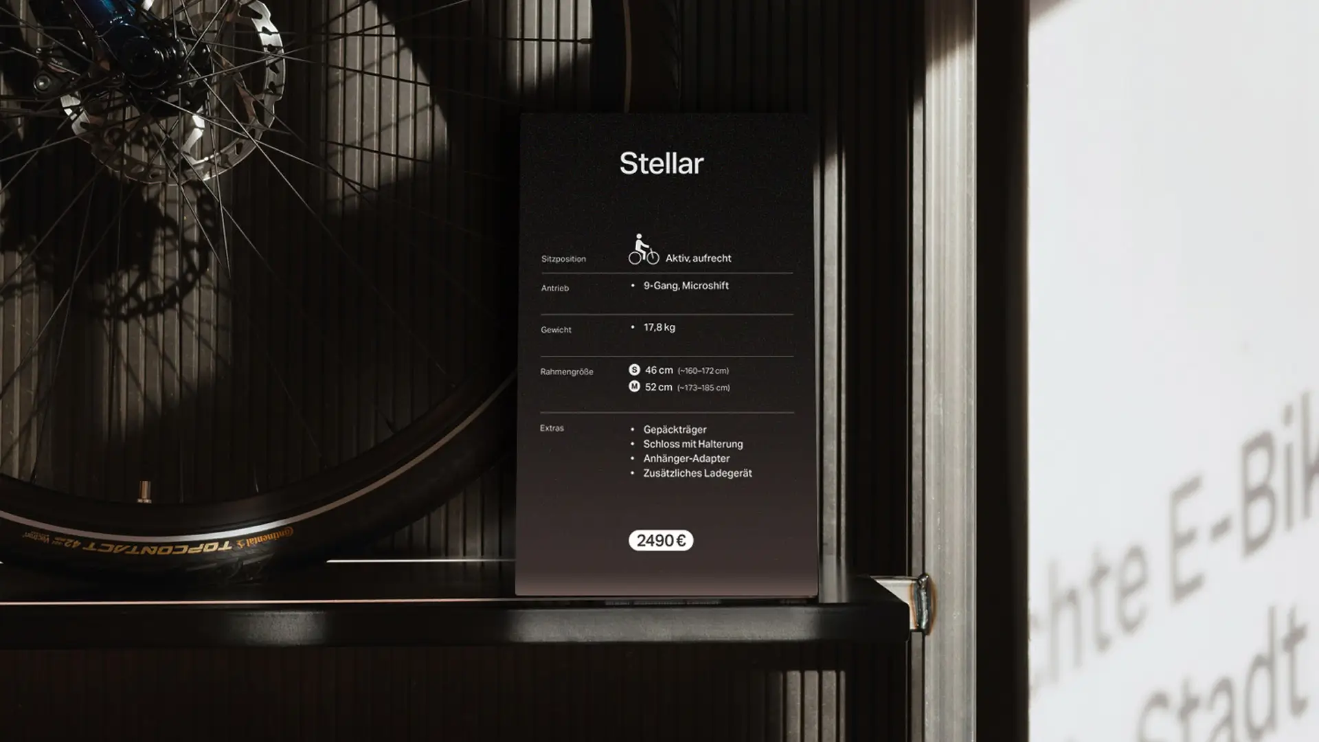
Retail & Fair — Immersive Brand Space
Ampler’s showrooms were revamped into true brand experiences. The spaces invite customers to browse bikes, chat with experts, and most importantly test ride, all within a unified Ampler world.
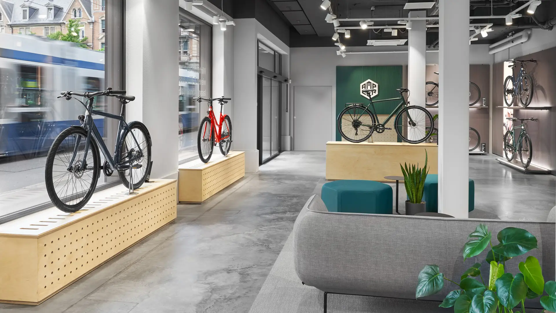
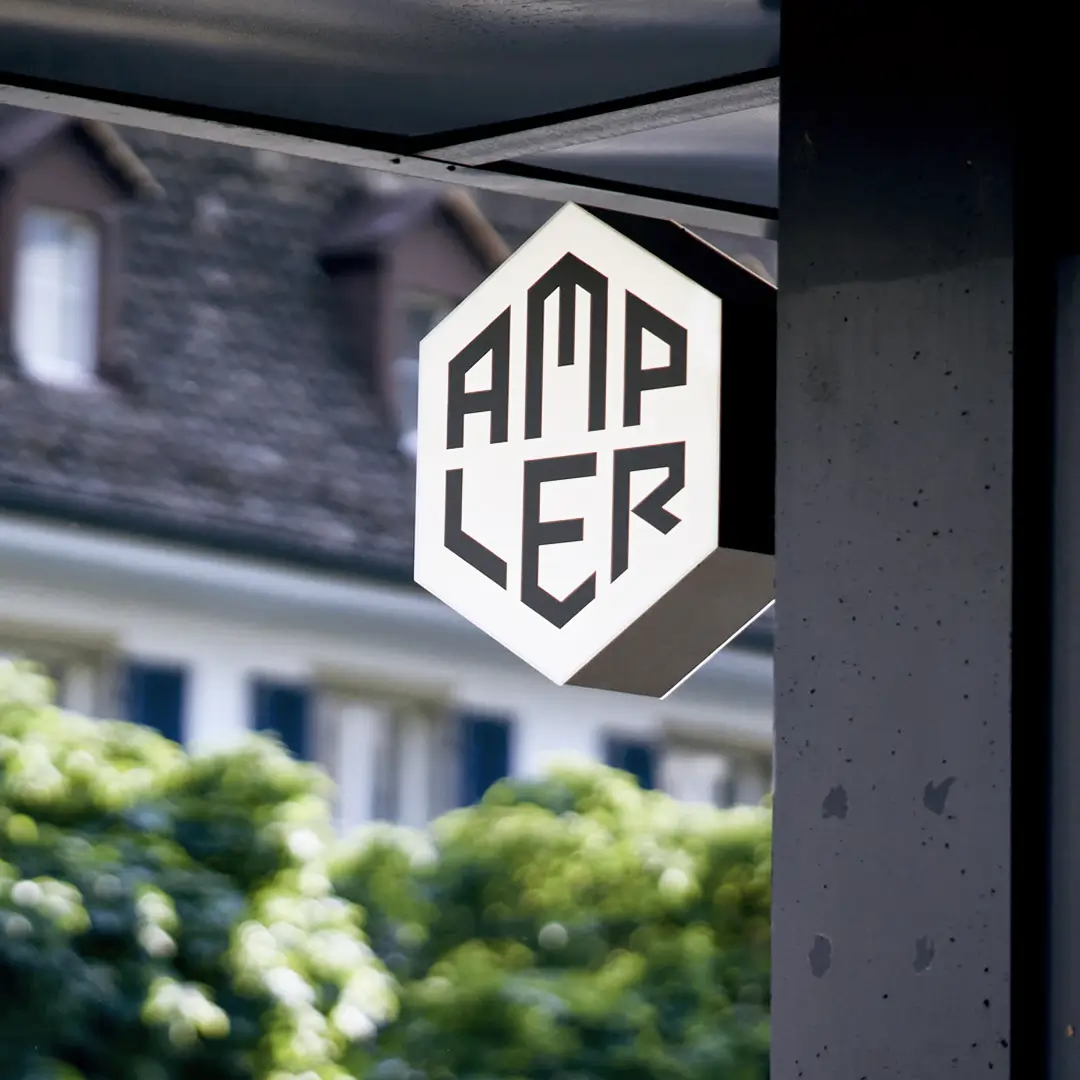
Ampler showroom in Zurich
Results & Reflection — A scalable design ecosystem
The rebrand directly supported Ampler’s rapid growth: within a year, sales and team size doubled, and the company expanded its showrooms from 2 to 6 across Europe. Thanks to the unified design system, new bikes, languages, and campaigns could be launched faster and with visual consistency. Overall the rebrand turned Ampler’s vision of effortless urban mobility into a tangible, scalable brand experience, online and in the real world.

© Anna Saar, 2026
Text, images, code made with 💕and ☕
Text, images, code made with 💕and ☕
© Anna Saar, 2026