GRVL Series
Rebranding
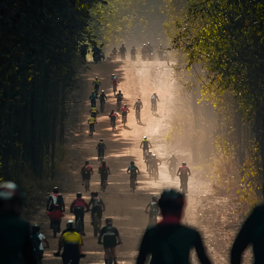
GRVL is an international gravel cycling event series known for its strong community spirit and growing global reach. As the series expanded across regions, seasons, and formats, its visual identity required a clearer and more scalable foundation. This project proposes a redesigned brand system built to grow with the series, creating a recognizable and flexible identity for a growing global gravel culture.
| Product | Scalable brand Identity for GRVL Series |
| Role | Brand Identity Designer |
| Key Skills | Brand strategy Logo & identity design Typography systems Color systems Modular visual systems Brand scalability Merchandise design |
| Team | Anna Saar |
| Client | GRVL Series |
Challenge — Scaling a brand across events, regions, and formats
GRVL has grown into a global event series with a strong and inclusive community. While the spirit of the events was clear, the visual identity lacked a consistent and scalable foundation across different locations and touchpoints. The challenge was to create a system that could:
- remain recognizable across all events
- adapt to local character and context
- scale across formats, seasons, and media
Project Roadmap
1
Brand Audit
Understanding what already resonated within the community and where consistency broke across events
2
Core Identity
Developing a distinctive wordmark and logo system that works across scales and applications
3
System Definition
Establishing typography, color logic, and modular rules to enable flexible compositions
4
Real-world Validation
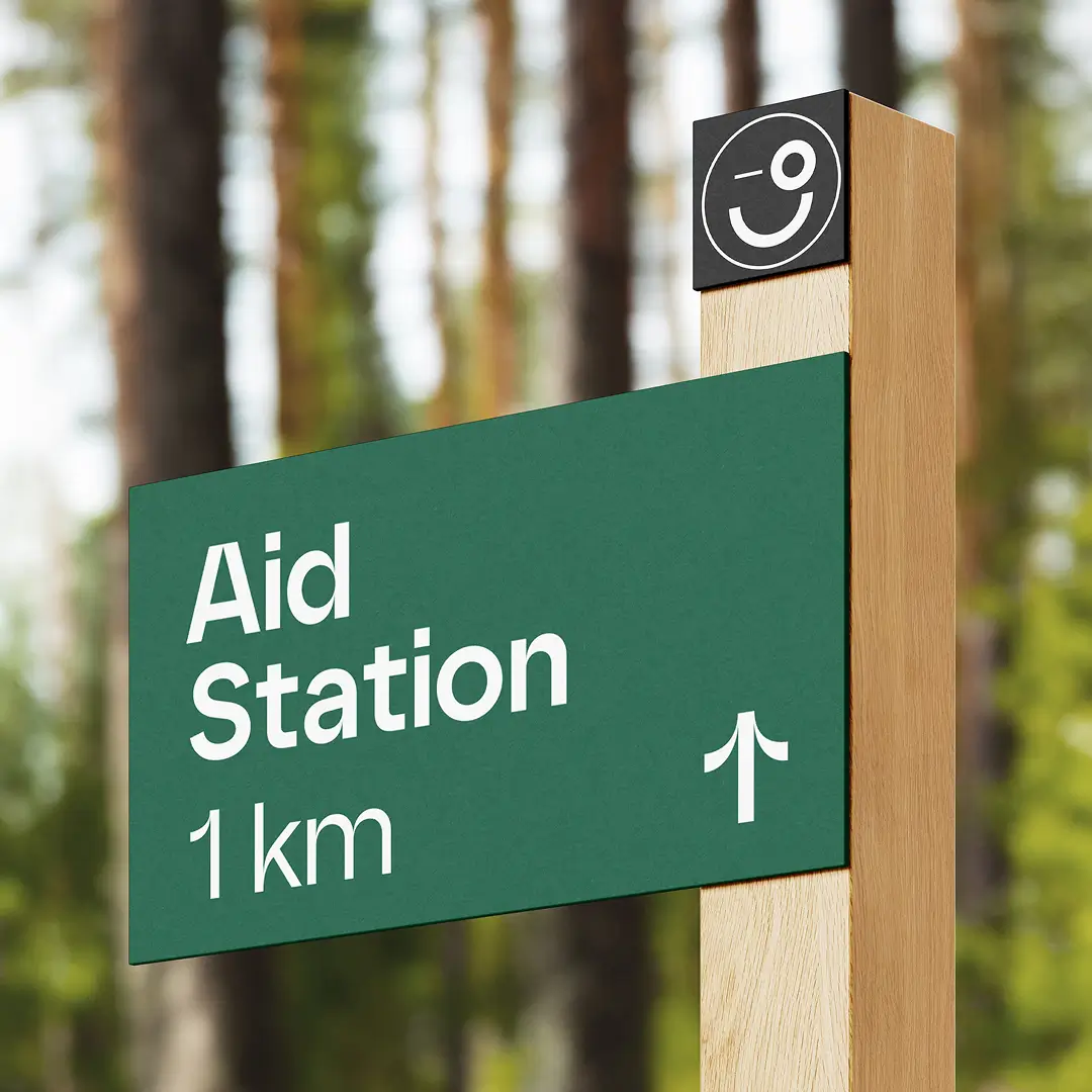
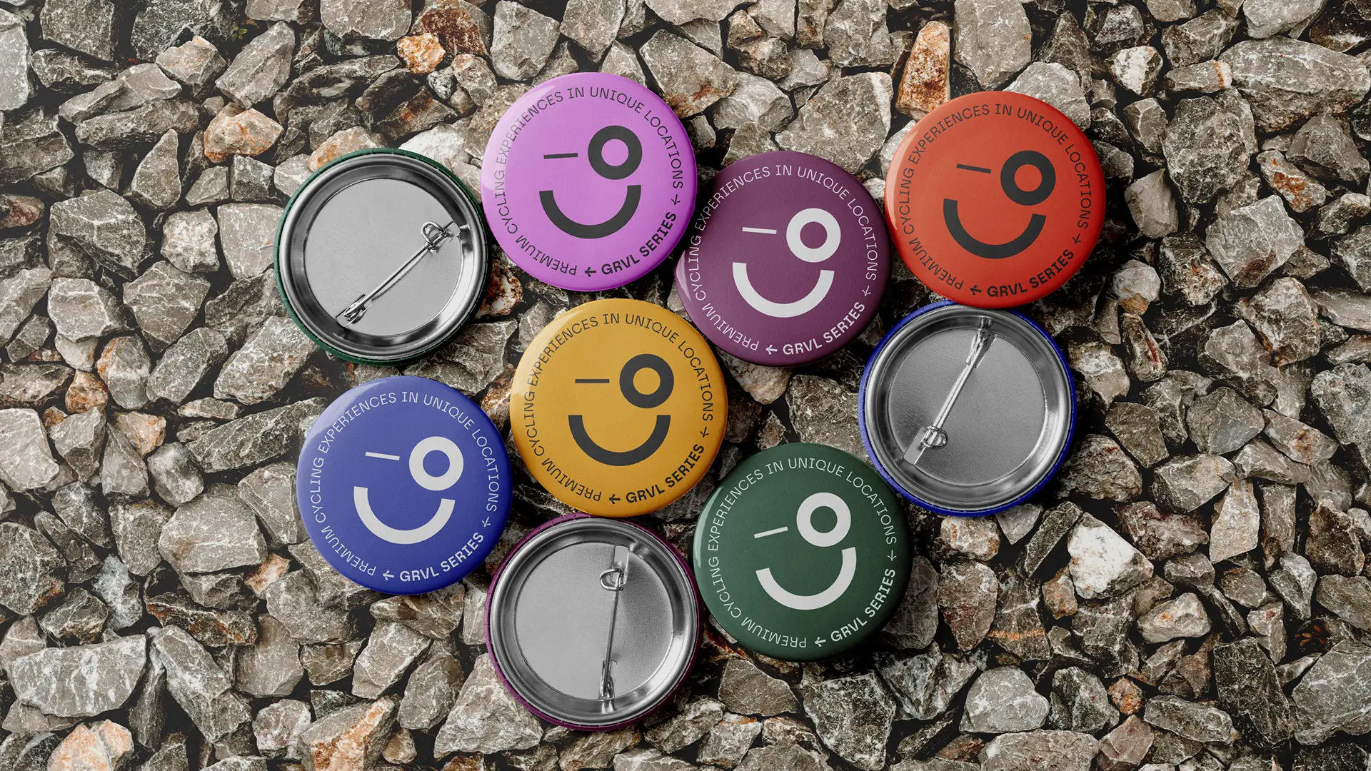
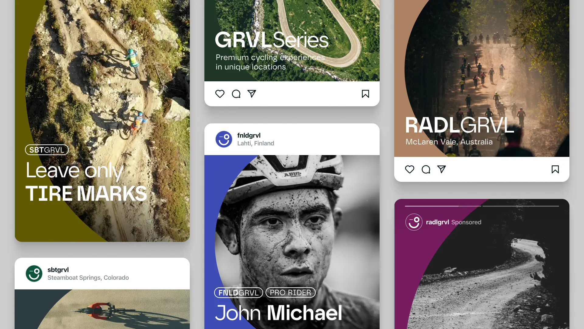
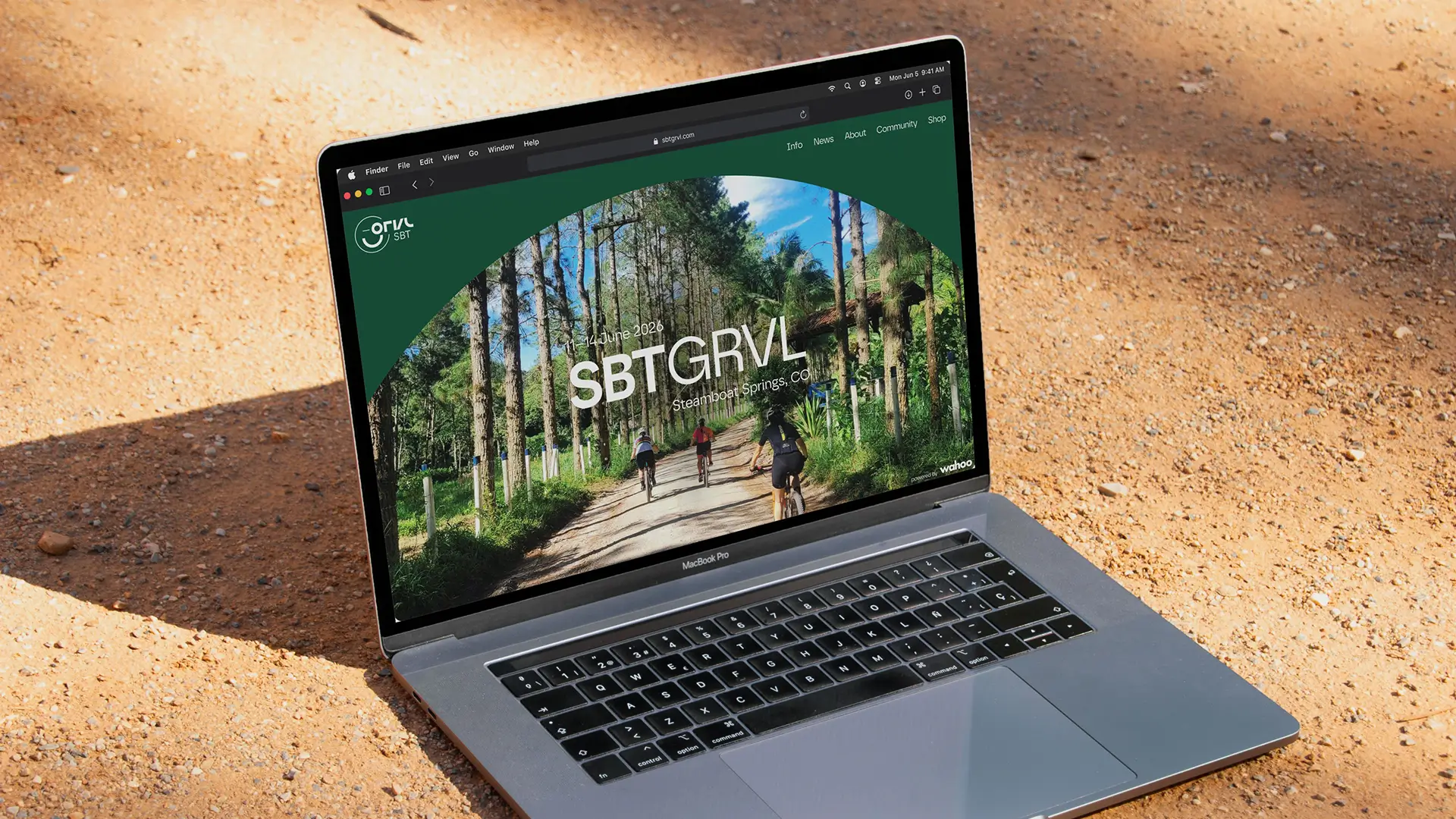
Applying the system across realistic touchpoints such as merchandise, signage, and event communication
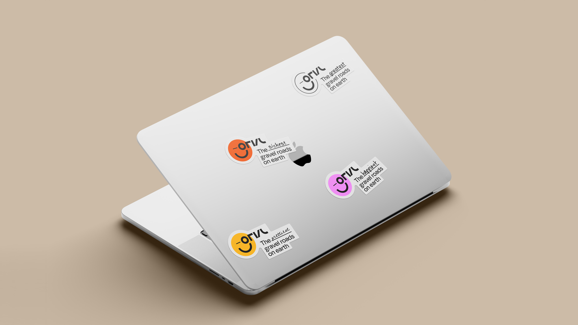
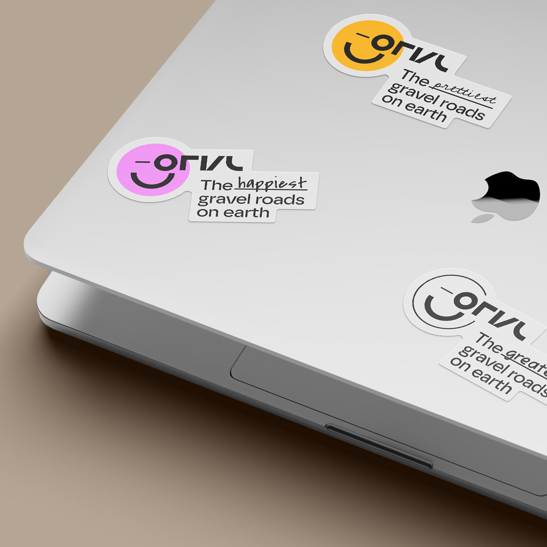
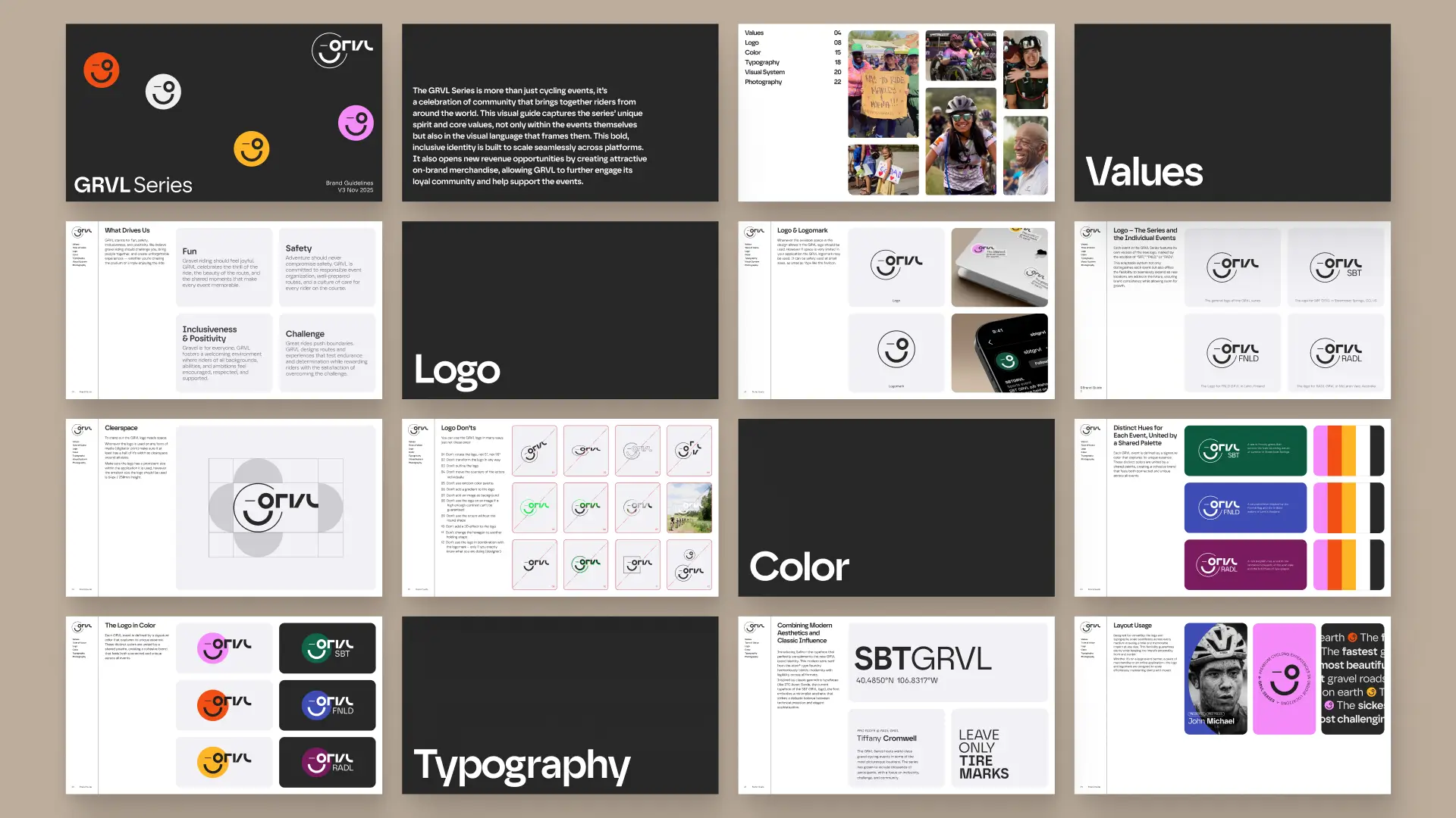
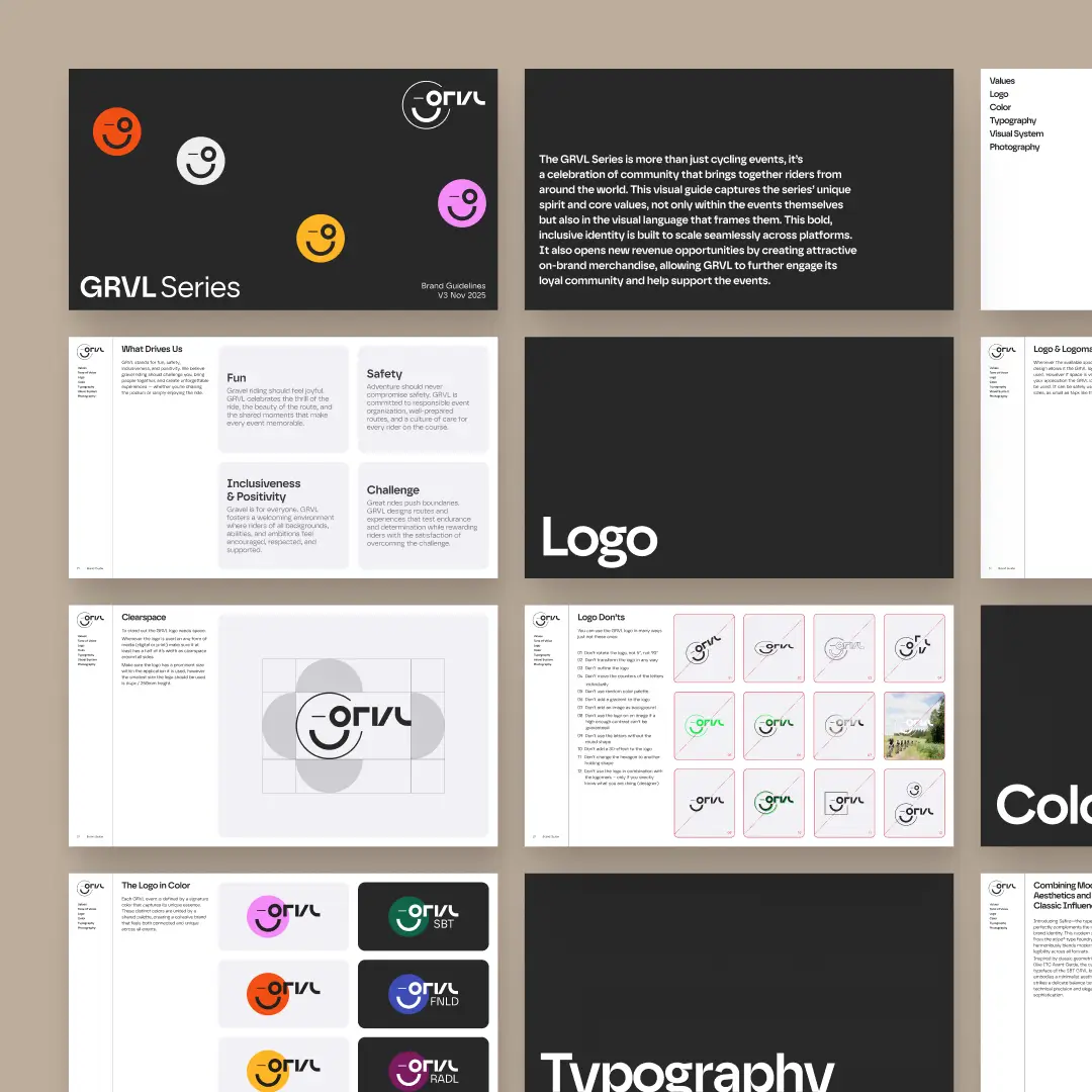
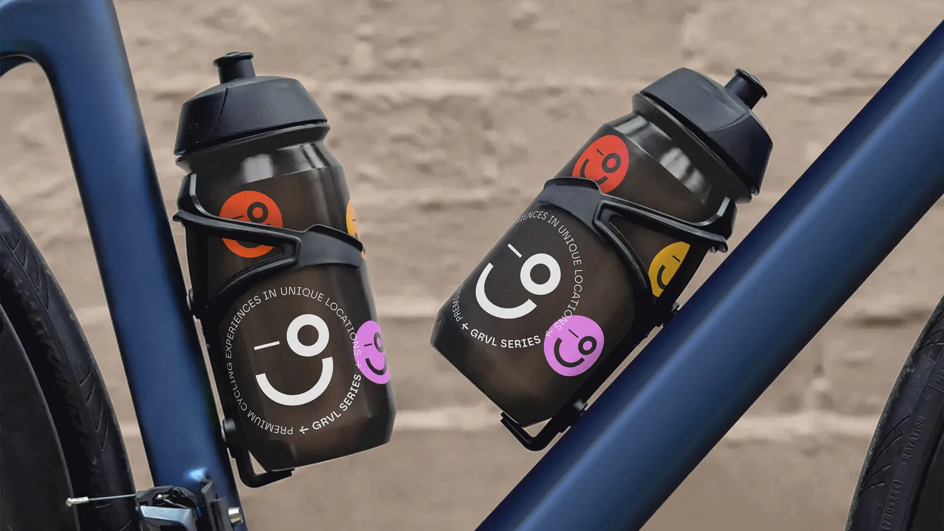
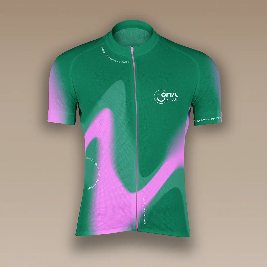
Solution — A modular identity built for flexibility and recognition
The resulting identity is built around a strong, recognizable core that expands into a flexible visual system. At its center is a playful and scalable logo, designed to reflect the openness and energy of the GRVL community. Around it, a modular system of typography, color, and graphic elements allows each event to express its own character while staying part of a unified series. The system enables:
- consistent branding across all events
- flexible adaptation to local contexts
- clear recognition across digital and physical touchpoints
Logomark— Scaling across small applications

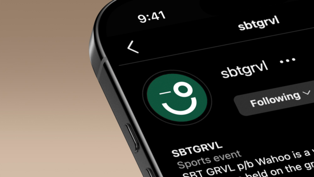
The Events— Recognition and Distinction
System — Building blocks of the identity
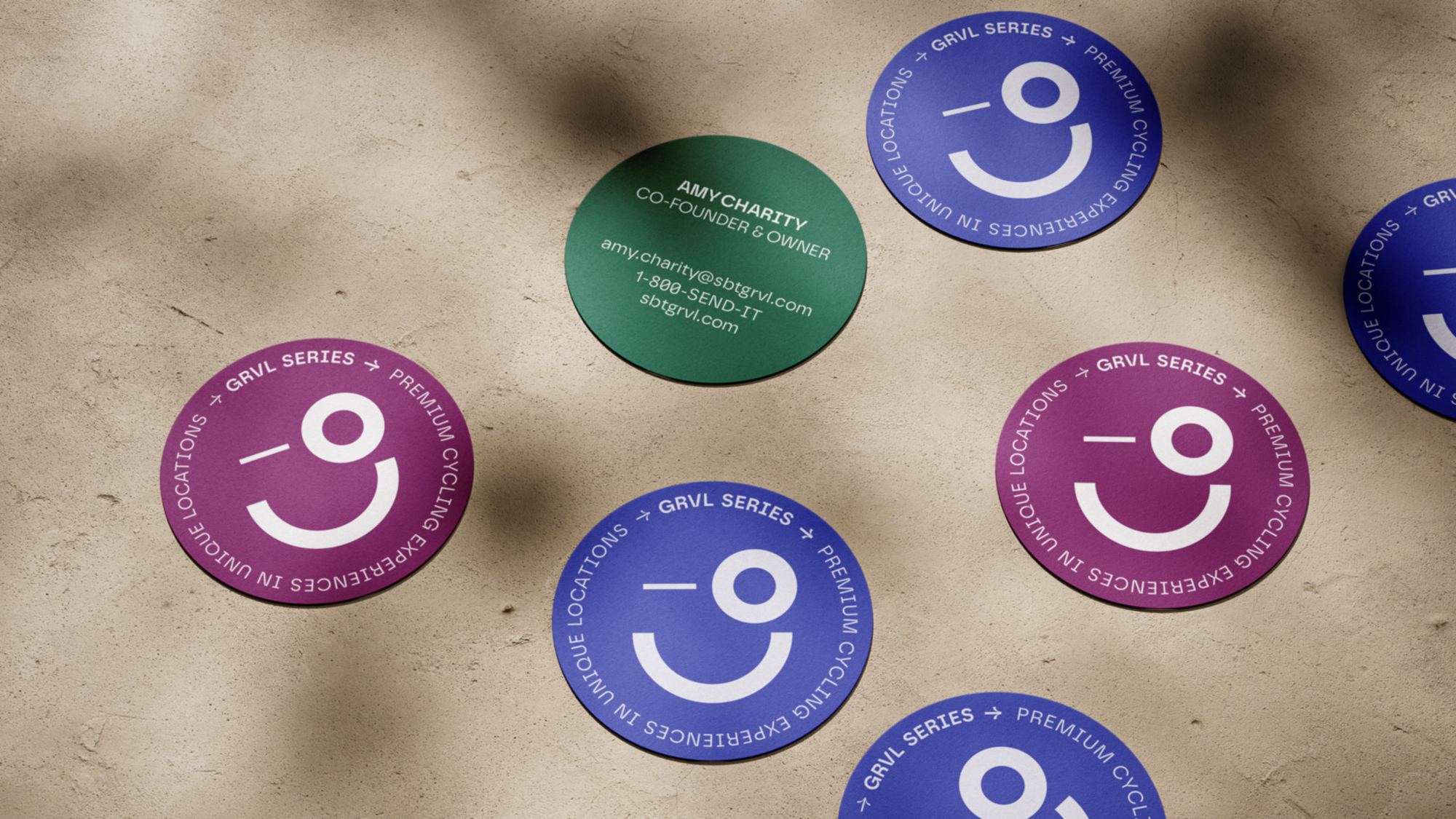
Color System
#0E543C — Forest Green
A warm, foresty green that echoes the lush, blooming nature of summer in Steamboat Springs, Colorado.
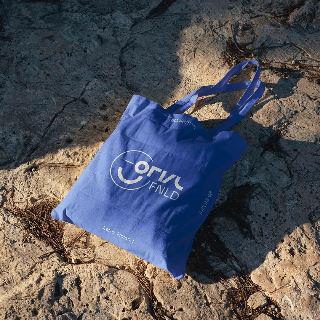
#3e4cb4 — Lake Blue
A saturated blue inspired by the Finnish flag and the brilliant waters of Lahti’s Vesijärvi.
#771c5e — Deep Ruby
A rich purplish-red, a nod to the renowned vineyards of McLaren Vale and the bold hues of ripe grapes.
Typography
Visual System
Documentation
Impact — A foundation for growth, community, and consistency
The new identity establishes a scalable foundation for the future of the GRVL Series. It supports:
- expansion into new regions and event formats
- consistent communication across all touchpoints
- stronger brand recognition across the global cycling community
- new opportunities for merchandise and event-driven revenue
© Anna Saar, 2026
Text, images and code made with 💕and ☕
Text, images and code made with 💕and ☕
© Anna Saar, 2026